- What Is Organic Brutalism, Actually?
- Why Your Nervous System Actually Loves Raw Texture
- The Palette of Organic Brutalism
- Key Organic Brutalism Materials and Textures
- Room-by-Room: Applying Organic Brutalism in a Renter-Friendly Way
- Shopping the Trend on a Realistic Budget
- Why Organic Brutalism Is More Than a Trend
- FAQ: Organic Brutalism Interior Design Trends
- Final Thought: Soft Concrete as Permission
There is a tension at the heart of the most interesting spaces being shaped right now. On one side: the raw, unapologetic weight of brutalist material exposed concrete, unfinished stone, visible aggregate. On the other: a desperate, bone-deep human need to feel held, not overwhelmed. And somehow, in the modern design landscape, those two contrasting impulses are colliding into something genuinely beautiful.
I’ve been watching this direction build for over a year in material lookbooks, emerging studio portfolios, and the slow drift of Pinterest saves toward palettes that feel simultaneously gritty and deeply cozy. Warm putty. Mushroom. Weathered chalk. Stone that looks like it just exhaled. Welcome to organic brutalism the interior design trend that asks: what if raw could also be gentle?
This isn’t a completely mainstream movement yet. It is currently sitting in that perfect early-adopter window visible enough to feel timely, yet niche enough to feel highly personal. Let me break it down: what it is, why our nervous systems are responding to it so strongly, and exactly how you can bring it into your home without needing a renovator’s budget or a landlord’s blessing.
What Is Organic Brutalism, Actually?
Classic brutalism that mid-century architectural movement of exposed concrete and fortress-like geometry was never known for warmth. It was bold. Ideological, even. But it was also cold in a way that made a lot of people quietly dread the buildings they worked in.
Organic brutalism is its emotional rewrite.
The keyword is softening. Where traditional brutalism gave you sharp-edged slabs, organic brutalism gives you raw material with rounded sensibility concrete that looks hand-trowelled rather than poured into a mould, stone with visible veining and warm undertones, textured plaster walls in colours borrowed from desert dusk or lichen-covered rock.
The brutalist DNA is still there in the commitment to material honesty and unvarnished texture. But the colour temperature shifts decisively warm, and biophilic forms curves, organic edges, nature-derived patterns soften the hardness.
Think of it as brutalism that’s been left in the sun. And somehow that changes everything.
How It Differs from Japandi and Warm Minimalism
You might wonder: is this just Japandi with concrete? Not quite. Japandi prioritises quietness low contrast, refined craft, restrained ornamentation. Warm minimalism lives in smooth, planed surfaces and neutral simplicity.
Organic brutalism, by contrast, actively celebrates texture and material complexity. The plaster is deliberately uneven. The concrete panel has visual incident. There’s a deliberate roughness that Japandi and warm minimalism tend to sand away. And that roughness, counterintuitively, is exactly where the sensory calm comes from.
Quick Answer · Organic Brutalism Interior Design Trend is an emerging interior design direction combining raw, unfinished materials concrete, stone, textured plaster with warm, nature-derived colour palettes and biophilic forms. It reinterprets brutalist material honesty through a sensory-calm lens, creating spaces that feel both grounded and deeply restful.
Key elements: warm concrete walls, limewash plaster, acoustic textile panels, and earthy tones rooted in the science of fractal fluency.
Why Your Nervous System Actually Loves Raw Texture
Here’s where it gets interesting and where the design-as-wellness conversation becomes genuinely scientific rather than just aesthetic.
Research in environmental psychology consistently shows that mid-complexity visual stimulation neither too sparse nor too chaotic produces the strongest stress-reduction response in human subjects. Smooth, featureless surfaces score surprisingly poorly here; they offer no visual “grip” for the wandering mind. Highly chaotic surfaces, by contrast, raise cortisol. But textures with visible, organic variation? That’s the sweet spot.
Concrete, raw stone, and hand-worked plaster hit this register almost perfectly. They provide what pioneer researcher and physicist Richard Taylor defines as fractal fluency our innate biological preference for patterns that mirror nature’s self-similar geometry. Taylor’s research, published in Frontiers in Human Neuroscience, demonstrates that the human visual system evolved alongside fractal-rich natural environments: tree canopies, river networks, coastlines. When our eyes encounter surfaces that echo those structures as raw concrete and hand-trowelled plaster do the brain activates a measurable relaxation response, reducing physiological stress by up to 60%.
📐 The Science Behind the Surface
Fractal fluency explains why organic brutalist materials raw concrete, textured plaster, aggregate stone — don’t just look calm. They are neurologically calibrated to produce calm. The irregular-but-patterned surface complexity sits at what Taylor identifies as a “mid-range fractal dimension” (D ≈ 1.3–1.5), the precise band that the human visual cortex processes most efficiently. Below this band: visual understimulation, restlessness. Above it: visual overload, anxiety. Organic brutalism lives right in the middle.
I explored the measurable impact of these patterns in detail when writing about the 60% stress rule and fractal patterns in decor that research maps directly onto why organic brutalist surfaces work on us the way they do. Concrete walls and raw plaster are, in a very real sense, nature’s fractal patterns translated into architectural material.
The Role of Warm Colour Temperature
Add warm colour temperature to that visual complexity, and you have a neurological one-two punch. The putty, mushroom, warm beige, and greyed-terracotta shades that define organic brutalism all sit in the circadian-friendly zone of the colour spectrum. They don’t trigger the alerting response that cool blues and bright whites can. Instead, they signal safety. Belonging. Late afternoon light. The kind of light that told our ancestors it was time to rest.
So the trend isn’t just aesthetically interesting. It’s doing something genuinely useful for how we feel inside our homes.
The Palette of Organic Brutalism
Colour is where organic brutalism distinguishes itself most immediately from its chillier ancestors. The palette this season is cohesive, earthy, and deeply wearable.
The Key Tones to Know
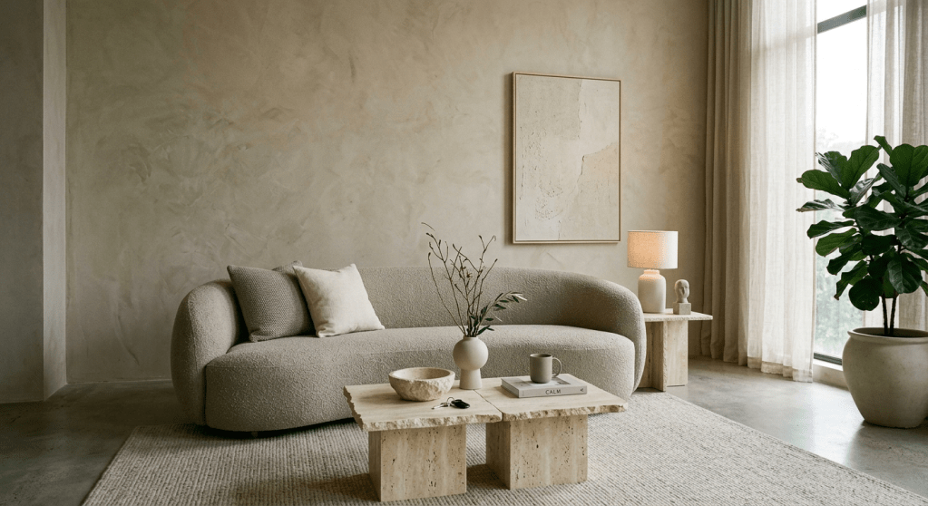
Warm concrete grey not cold, blue-toned grey but the grey of limestone in afternoon light. Almost beige. Almost brown. Neither.
Mushroom and greige the background hum of the entire movement. Endlessly versatile, endlessly calming.
Warm putty and bone a step lighter, these bring the breathable quality of undyed linen into concrete and plaster form.
Burnt sienna and terracotta accents used sparingly. A single wall. A cluster of ceramics. A rug with a rusted border. They warm the palette without overheating it.
Deep charcoal and near-black for grounding. Window frames, shelving, ironwork. The shadow that makes the warm tones glow.
What’s absent is equally telling: no white-white. No cool grey. No ochre-forward yellow. This palette is consciously nocturnal it wraps rather than brightens.
Key Organic Brutalism Materials and Textures
Trend palettes are one thing. But organic brutalism lives and dies in its materials and this is where the renter-friendly and budget-conscious angles open up beautifully. Here’s exactly how the shift from classic brutalism to its organic iteration plays out, material by material including your renter hack for each axis.
| Material Axis | Traditional Brutalism | Organic Brutalism (Shift) | Renter-Friendly Hack |
|---|---|---|---|
| Concrete / Walls | Cold, blue-grey poured slabs; industrial finish | Warm, hand-trowelled microcement in putty & bone tones | Adhesive microcement tiles or peel-and-stick concrete-look panels |
| Plaster & Surface | Flat, industrial exposed brick or cinder block | Mottled, breathable limewash plaster with irregular depth | Peel-and-stick limewash-effect wallpaper; water-based limewash paint (tenant-agreed) |
| Acoustics | High reverb, echoing, sound-amplifying bare space | Intentionally dampened, quiet environments via textile panels | Fabric acoustic panels on command strips or picture hooks no drilling |
| Form & Shape | Sharp, aggressive hard edges; right-angle geometry | Softened curves, rounded arches, organic and biomorphic edges | Freestanding curved pottery, rounded mirrors, arch-form decor objects |
| Stone & Aggregate | Raw aggregate exposed in functional, undecorated way | Warm travertine, basalt, rough marble displayed as objects of beauty | Raw stone accessories (bowls, trays, vases) zero installation required |
| Colour Temperature | Cold, grey-blue, institutional | Warm putty, mushroom, greige, terracotta biologically calming spectrum | Warm-toned LED bulbs (2200–2700K) transform any room instantly; no paint needed |
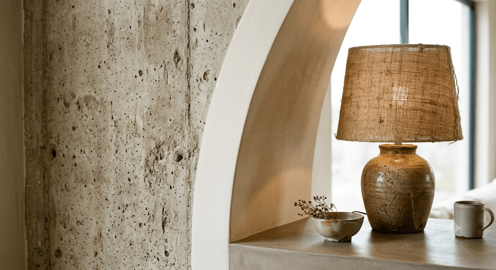
Limewash and Textured Plaster Walls
Limewash paint has had a remarkable moment across the past two years, but in 2027 it’s finding its most sophisticated expression through organic brutalism.
Applied with a brush in irregular, layered passes, limewash creates that mottled, ancient-wall depth that perfectly captures the movement’s mood.
For renters, water-based limewash-effect paints exist that clean off without structural damage always worth checking with your landlord, but the conversation is much easier than it used to be.
Textured plaster wall panels either applied directly or available as peel-and-stick for renters are another fast-track entry point. They read as high-effort architectural interventions but often install in an afternoon.
Soft Concrete and Microcement
Microcement is having an extraordinary moment. Historically confined to high-end renovations, microcement panels and adhesive-backed concrete-look surfaces have democratised the aesthetic enormously.
The surface catches light in ways that change dramatically throughout the day textured enough to be interesting, smooth enough to read as refined. For countertops, fireplace surrounds, even small feature walls in a rental, adhesive microcement tiles are a genuinely viable option now.
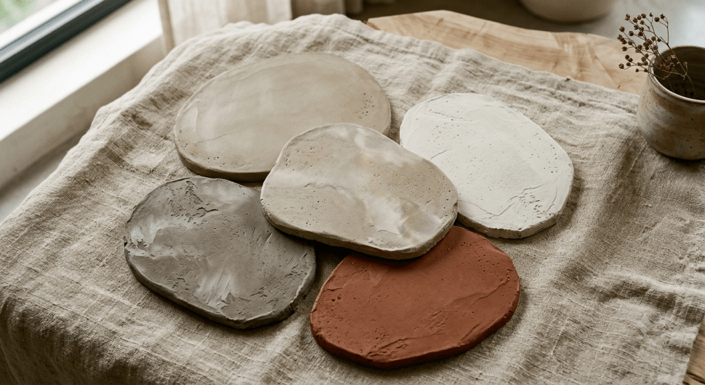
Raw Stone and Aggregate
Whether it’s a travertine side table, a rough-hewn marble catch-all tray, or a basalt vase that looks like it was pulled from a riverbed raw stone accessories are the organic brutalism entry point that requires zero commitment and zero permission. One good piece is enough to anchor the aesthetic.
Aesthetic Acoustic Textile Panels in Earth Tones
This is where function meets trend in the most compelling way. Aesthetic acoustic wall panels for renters have been a growing conversation on the blog, and within an organic brutalism scheme they become fully intentional design statements rather than pragmatic additions.
Imagine a large-format acoustic panel in warm putty-coloured woven fabric installation is typically command-strip or simple picture hooks, no wall damage, removable when you move. But visually? It reads as a considered, architecturally aware choice. It absorbs both sound energy and visual noise simultaneously, which is the double win that sensory-calm interior design is built around. The sensory gating principle using sound-dampening art to quiet open-plan anxiety maps directly onto organic brutalism’s material philosophy.
“The most useful thing a renter can put on a concrete-look wall? A large-format acoustic textile panel in an earthy tone. It handles sound, softens the aesthetic, and requires nothing more than a hook.”
Room-by-Room: Applying Organic Brutalism in a Renter-Friendly Way
Theory is good. Specifics are better. Here’s how I’d apply this trend room by room without a single screw your landlord would disapprove of.
Living Room: The Textural Anchor
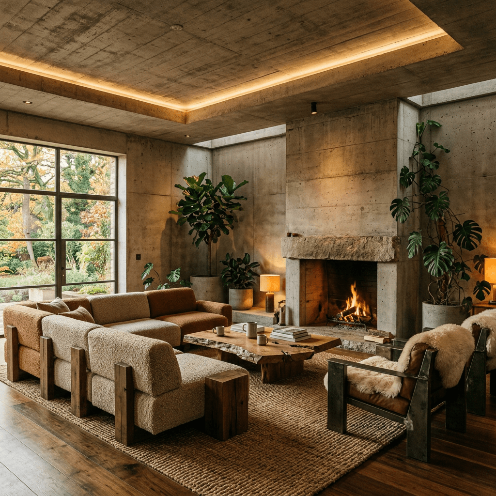
Start with a large-format concrete-look rug. It immediately shifts the room’s material language without touching a wall. Layer over it a sofa in warm greige or aged putty linen slipcovers are your friend here. Then add one acoustic textile wall panel in a warm stone tone on the largest wall. The room now has the organic brutalism trifecta: raw material reference, textural depth, and acoustic softness.
Plants with strong silhouettes fig trees, olive trees, large-leaved monstera add the biophilic dimension that stops the scheme from feeling austere. A floor lamp with a matte concrete-look base ties the material story closed.
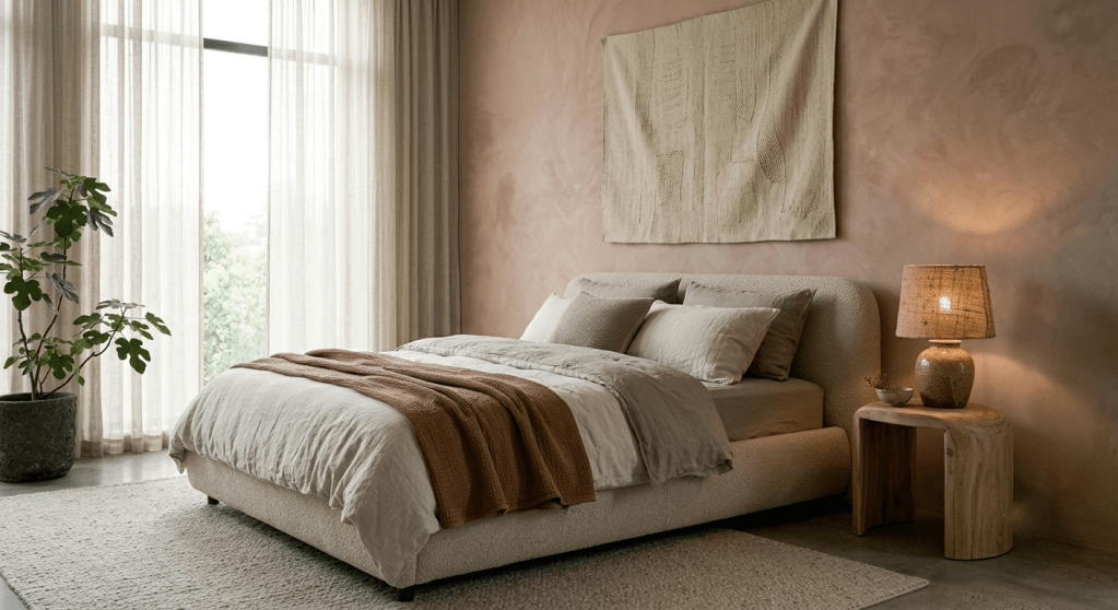
Bedroom: Softness Over Rawness
The bedroom iteration of organic brutalism leans harder on the “organic” than the “brutalist.” Limewash-effect wallpaper behind the bed creates architectural depth without the commitment. Linen bedding in warm bone or mushroom, a bedside table in raw travertine or pale wood, and a small basket-weave ceramic lamp complete the palette.
The bedroom is also where a morning light routine matters enormously organic brutalism’s warm, cave-like quality in the evening transitions beautifully into soft, golden-toned morning light if you layer it with amber-tinted bulbs that you swap out at sunrise.
I explored this connection in decor tricks for stress-reducing morning routines, the material palette and the light palette are doing the same biological job.
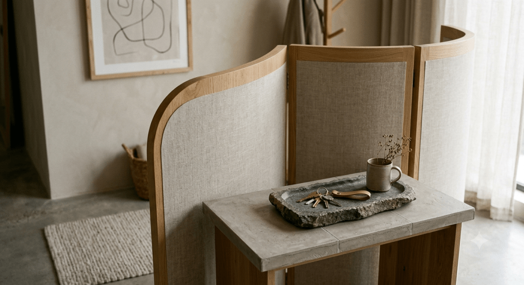
Entryway: The First Sensory Signal
Small spaces punch above their weight in organic brutalism because material density reads as intentional rather than cramped. A concrete-effect console table, a textured ceramic vessel for keys, a woven jute mat, and a small acoustic panel on the wall opposite the door that’s a complete and genuinely striking entryway scheme in four objects.
The entryway is an underrated psychological pivot point. I covered the science behind this in the threshold effect and sensory entryway design for anxiety relief what your nervous system encounters the moment you step inside your home determines your baseline stress level for the next hour. An organic brutalist entryway, with its grounding textures and warm palette, is specifically designed to decelerate rather than stimulate.
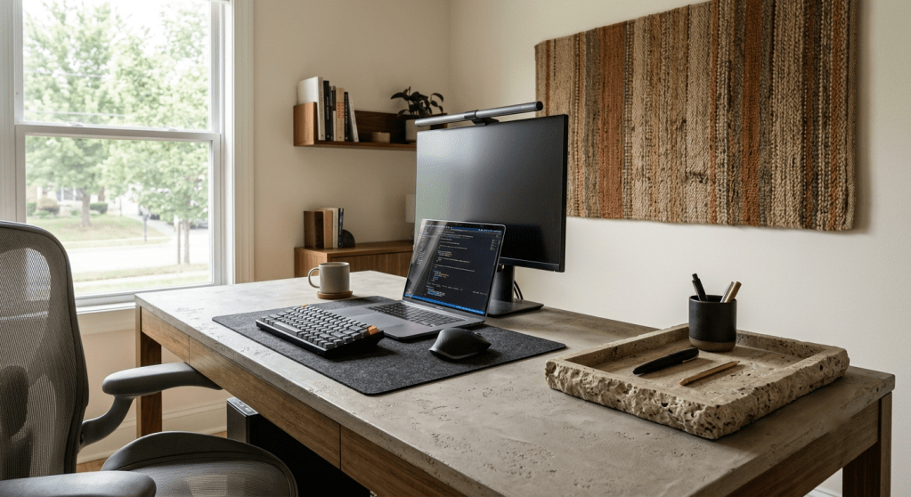
Home Office: Concentration Through Material Calm
A microcement-look desk or shelf unit behind your screen provides the fractal fluency your peripheral vision craves maintaining low-grade alertness without triggering distraction. Warm acoustic panels reduce reverb and the echo-fatigue that comes with video calls. Earth-toned ceramics and one or two stone objects anchor the desk surface.
You’re working inside a material landscape that your nervous system reads as stable and bounded. Productivity research consistently correlates this kind of environmental groundedness with sustained cognitive performance and it’s a far cry from aggressively white, minimalist home office setups that actually increase cortisol in some subjects due to their visual bareness.
Shopping the Trend on a Realistic Budget
One of the most accessible things about organic brutalism is that it actively rewards imperfection, age, and patina. Thrift stores and second-hand platforms are genuine treasure troves. A slightly worn concrete planter.
A travertine bowl that someone clearly bought during the 2022 stone moment and no longer wants. A chunky ceramic vase that was hand-thrown decades ago. These all slot into an organic brutalism scheme as if they were made for it.
For new purchases, the price hierarchy runs like this: start with textiles (always budget-accessible), move to ceramics (mid-range), consider a statement stone piece when ready (investment), and think about limewash paint or acoustic panels as your one bigger-ticket commitment that pays dividends in the entire room’s atmosphere.
Renter-Specific Solutions That Don’t Compromise the Aesthetic
Command strips. Peel-and-stick concrete-look wallpaper panels. Adhesive microcement tiles designed for temporary installation. Large freestanding acoustic room dividers in earthy-toned fabric. Oversized rugs that redefine the floor plane.
These are your toolkit and used with intent, they produce results that are almost indistinguishable from the permanent versions at a third of the cost and zero deposit risk.
Why Organic Brutalism Is More Than a Trend
There’s something underneath the aesthetic that explains why it’s resonating so widely right now, and it goes beyond seasonal styling cycles.
We’ve spent years living in homes that were optimised for photography rather than habitation. Crisp whites. Perfect styling. Surfaces that show fingerprints. And collectively, I think we’re exhausted by it.
Organic brutalism offers an escape from performative interiors a design language that actively gets better with time, wear, and imperfection. A limewash wall that develops subtle variation with age. A concrete surface that acquires marks and character. A stone bowl that darkens and deepens as it’s used.
This is, at its philosophical core, a direction about accepting materiality. Accepting the fact that spaces change with us, rather than demanding we maintain them as showrooms.
That’s not just good design. That’s a genuinely healthier relationship with the space you live in.
FAQ: Organic Brutalism Interior Design Trends
What is organic brutalism in interior design?
Organic brutalism is a 2027 interior design direction that reinterprets brutalist raw-material aesthetics concrete, stone, unfinished plaster through a warm, nature-inspired lens.
Unlike traditional brutalism, it prioritises sensory calm, biophilic forms, and earthy colour palettes to create spaces that feel grounded and restorative.
What is fractal fluency and why does it matter for organic brutalism?
Fractal fluency, pioneered by physicist Richard Taylor, describes the human brain’s innate preference for patterns that mirror nature’s self-similar geometry the same repetitive-but-varied structure found in coastlines, trees, and river networks.
Raw concrete, stone, and hand-worked plaster exhibit this fractal character, which is why organic brutalism triggers an involuntary calming response in the people who inhabit it. Taylor’s research documents stress reductions of up to 60% when people are exposed to surfaces with the right fractal dimension.
Is organic brutalism suitable for renters?
Yes, many core elements are renter-friendly by design. Acoustic textile wall panels, peel-and-stick textured wallpaper, removable limewash-effect paint, adhesive microcement tiles, and freestanding concrete-look furniture all achieve the aesthetic without permanent changes. Accessories like raw stone objects and woven ceramics layer the material story without any installation at all.
What colours define organic brutalism in 2027?
The 2027 organic brutalism palette centres on warm concrete grey, mushroom, putty, bone, and greige, with accent notes of terracotta, burnt sienna, and deep charcoal for grounding. Cool greys, bright whites, and high-contrast combinations are notably absent from the movement.
How is organic brutalism different from warm minimalism?
Warm minimalism prioritises smooth, planed surfaces and restrained ornamentation. Organic brutalism actively celebrates material texture, visible irregularity, and surface complexity.
Both share warm colour palettes, but organic brutalism’s commitment to raw, worked surfaces gives it a distinctly different tactile and visual quality.
Final Thought: Soft Concrete as Permission
What I love most about this direction and why I believe it’ll sustain well beyond a single seasonal cycle is that it gives people permission to stop fighting their homes. Permission to let material be material. Permission to choose things that feel good to touch and look at rather than things that photograph neutrally.
Raw texture, warm colour, the gentle acoustic softening of a textile panel on a plaster wall. It all adds up to a space that doesn’t perform for guests; it works for you.
And in 2027, that feels like exactly the design brief we need.
Have you started experimenting with organic brutalism in your home? I’d love to hear what you’ve tried drop it in the comments below.
