- 🎯 Quick Fix Summary
- Why South and West-Facing Rooms Rarely Have This Issue
- 1. Test in Your Actual Lighting (No, Seriously)
- 2. Choose Blues with Warm or Neutral Undertones
- 3. Increase Your LRV
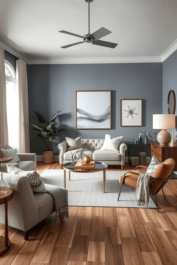
- 4. Warm Up Your Lighting
- 5. Add Warm Accents and Textiles
- 6. Use a Tinted Primer
- 7. Embrace It (Or Repaint Strategically)
Picture this: You spent three weekends sampling paint chips. You narrowed it down to that perfect blue the one that would transform your living room into a serene coastal retreat. The can promised “soft sky” and “tranquil waters.”
What you got? Bruised plum.
Welcome to the 2026 Blue Shift the paint phenomenon that’s driving DIYers absolutely mad. If your gorgeous blue paint looks purple, gray, or downright muddy the moment it hits your walls, you’re not alone. And more importantly? You’re not crazy.
Let me tell you exactly why this happens and, more critically, how to fix blue paint undertones in 2026 with strategies that actually work.
🎯 Quick Fix Summary
If your blue looks purple: Switch to 2700K warm LED bulbs immediately and choose blues with green or gray undertones (LRV 50+). Avoid any blue with hints of violet or red. Test large swatches for 72 hours in your actual lighting before committing. North-facing rooms need blues like Benjamin Moore’s Palladian Blue or Sherwin-Williams’ Sleepy Blue they resist the purple shift.
What Is the Blue Shift Phenomenon (And Why Is Everyone Talking About It)?
The Blue Shift isn’t some conspiracy by paint manufacturers to ruin your Saturday. It’s a legitimate optical phenomenon that occurs when cool-toned blue paints interact with specific lighting conditions particularly the dreaded north-facing light.
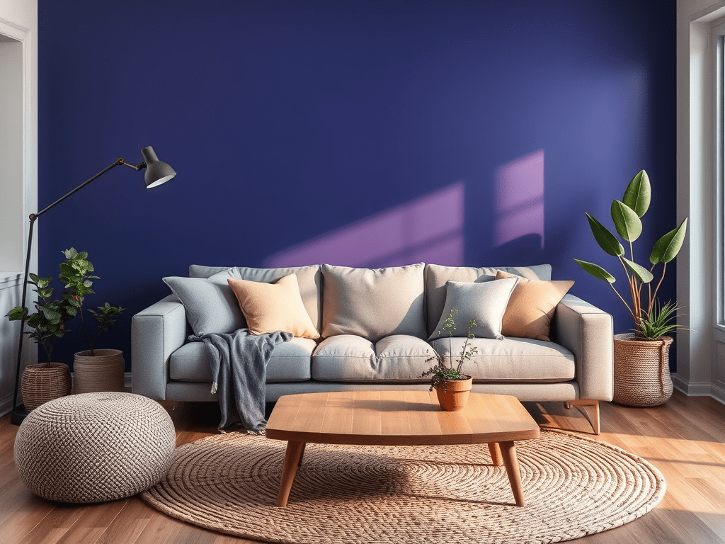
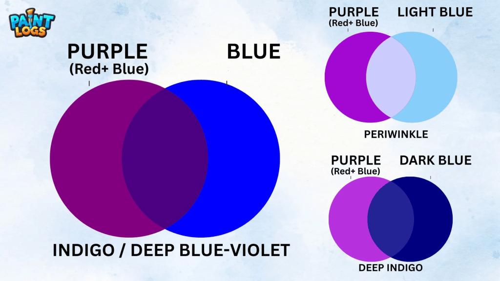
Here’s the science without the headache: Blue pigments are incredibly sensitive to the color temperature of light. When natural north-facing light (which skews blue-gray and cool) hits a wall painted with blue that has red or violet undertones, those hidden pigments activate. Suddenly, your “perfect blue” reads purple, lavender, or an unsettling gray-violet hybrid.
The phenomenon has intensified in 2026 because of trending paint formulations. Designers have been gravitating toward complex, layered blues the kind with depth and “movement.” Beautiful in theory. Problematic in north-facing rooms.
Think of it this way: paint isn’t just one color. It’s a recipe. And when you add the wrong lighting ingredient, the whole dish changes flavor.
The North-Facing Light Problem (Every DIYer’s Nightmare)
North-facing rooms are notoriously difficult to decorate. Why?
The light from the north never receives direct sunlight (in the Northern Hemisphere). Instead, it remains consistently cool, blue-toned, and flat throughout the day. There’s no warm morning glow or golden afternoon rays to balance things out. Just relentless, cool illumination that amplifies every cool undertone in your paint.
I learned this the hard way in my own home. My office faces north, and I thought a soft blue-gray would create the perfect focused atmosphere. The result looked like I’d painted the walls with storm clouds. Not exactly inspiring.
Through countless hours researching and experimenting with different shades in my own spaces, I’ve discovered that window orientation matters more than almost anything else. Choosing the best paint colors for your home requires understanding how light behaves in each specific room not just picking pretty colors from a fan deck.
Why South and West-Facing Rooms Rarely Have This Issue
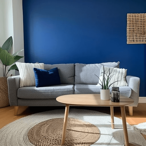
Contrast that with south-facing rooms, which bathe in warm, golden light most of the day, or west-facing spaces that capture those gorgeous sunset tones. These rooms actually warm up cool paint colors, neutralizing purple undertones before they can fully emerge.
It’s why your friend’s blue looks phenomenal in her sunlit bedroom, but yours looks like a Barney resurrection.
The Hidden Culprits Behind Purple-Looking Blue Paint
Beyond lighting, several other factors contribute to the blue-to-purple transformation:
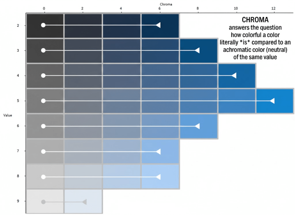
Light Reflectance Value (LRV) conflicts. LRV measures how much light a paint color reflects on a scale from 0 (pure black) to 100 (pure white). Blues with low LRVs (under 20) absorb more light, which intensifies undertones. In dim, north-facing light, those undertones go rogue.
Surrounding colors. Your flooring, furniture, and even adjacent wall colors influence how your blue reads. A blue with slight red undertones next to warm oak floors? That red gets amplified, pushing the blue toward purple.
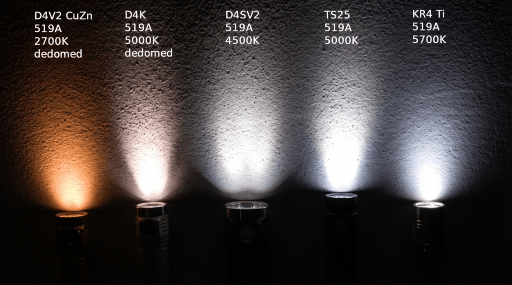
Artificial lighting temperature. If you’re using LED bulbs with cool white light (5000K+), you’re essentially doubling down on the north-facing light problem. Those bulbs emit blue-spectrum light that exacerbates cool undertones.
Paint sheen matters more than you think. Flat and matte finishes absorb light, deepening undertones. Eggshell and satin reflect more light, which can help balance things out—but they also show imperfections more clearly. It’s a trade-off.
The undertone wasn’t what you thought. This is the big one. That “gray-blue” might actually be a “purple-blue” or “violet-gray” in disguise. Paint names are marketing tools, not scientific descriptions.
How to Fix Blue Paint Undertones 2026: 7 Solutions That Work
Alright, enough diagnosis. Let’s fix this.
1. Test in Your Actual Lighting (No, Seriously)
Stop trusting tiny paint chips under fluorescent store lighting. Just stop.
Get sample pots and paint large swatches at least 2×2 feet directly on your walls. Live with them for 72 hours minimum. Observe them in morning light, afternoon light, evening light, and under your artificial lighting at night.
I recommend painting samples on multiple walls in the same room if possible. Light shifts throughout the day, and what looks perfect at 10 AM might look disastrous at 7 PM.
2. Choose Blues with Warm or Neutral Undertones
If you’re battling north-facing light, avoid blues with red, violet, or purple undertones entirely. Instead, look for blues with:
- Green undertones (teal-leaning blues)
- Gray undertones (true gray-blues, not blue-grays)
- Beige/greige undertones (yes, this exists—think “blue with a hint of warmth”)
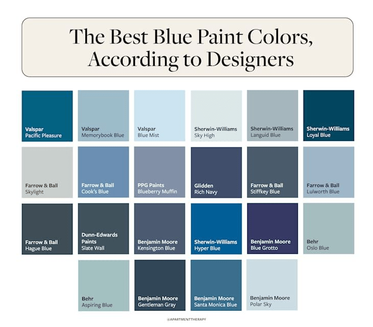
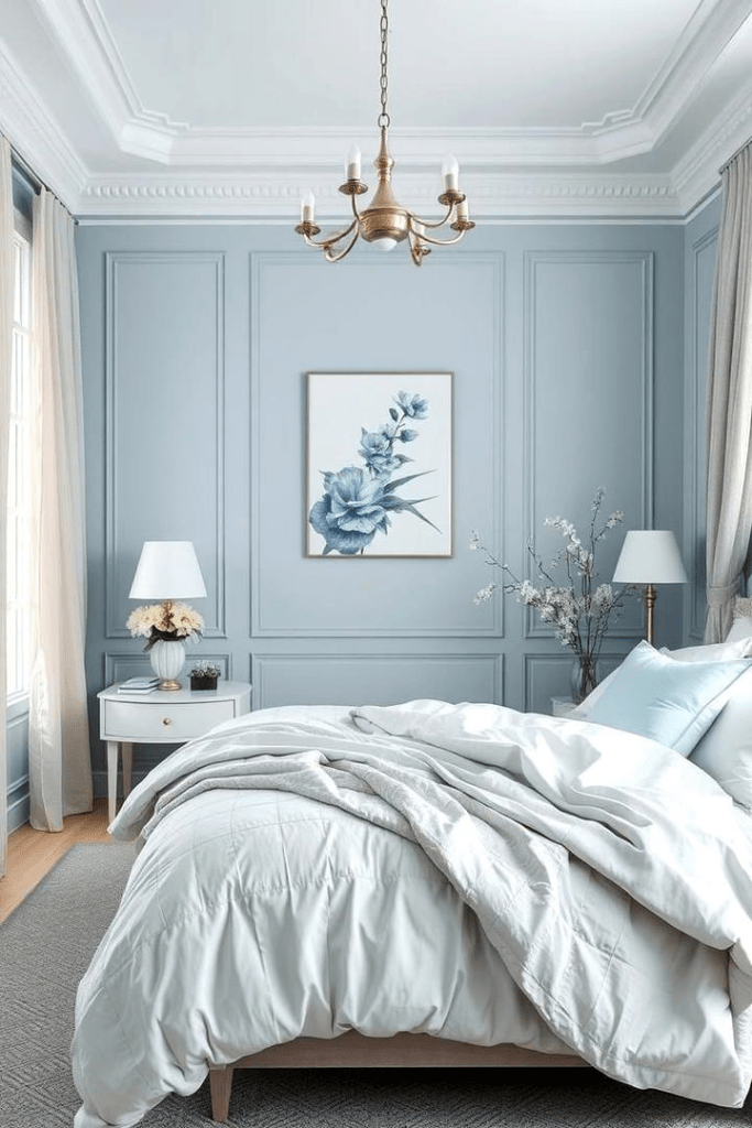
Some go-to options that resist the purple shift: Benjamin Moore’s Palladian Blue HC-144 (green undertone), Sherwin-Williams’ Krypton SW 9274 (true gray-blue), and Farrow & Ball’s Borrowed Light No. 235 (barely-there blue with warmth).
The warmth revolution in home decor has proven that adding subtle warmth prevents that sterile, cold feeling that plagued the all-gray trend.
3. Increase Your LRV
If you’re set on a specific blue, go lighter. Choosing a shade with an LRV above 50 reflects more light and minimizes undertone intensity.
Think of it like turning up the brightness on a photo the colors become less saturated, which means undertones become less prominent.
4. Warm Up Your Lighting
This is the fastest fix that doesn’t involve repainting.
Replace cool LED bulbs (4000K-5000K) with warm LED bulbs (2700K-3000K). This adds yellow-toned light to your space, which counteracts the blue-coolness of north-facing natural light.
Consider adding multiple light sources at different heights: table lamps, floor lamps, sconces. Layered lighting creates dimension and reduces the flatness of north-facing light.
For north-facing rooms specifically, I’m obsessed with warm Edison-style LED bulbs. They create a cozy glow that transforms cool paint colors without overwhelming the space.
To understand more about Kelvin temperatures, see this guide by Waveform Lighting.
5. Add Warm Accents and Textiles
Sometimes the paint isn’t the problem it’s the lack of balance in the room.
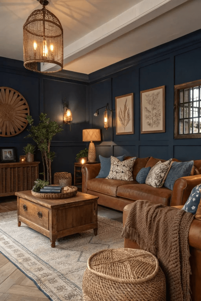
Warm wood tones, brass fixtures, terracotta pots, rust-colored throw pillows, and cream-colored textiles all introduce warmth that counteracts cool blue undertones. Color drenching techniques can also help you create intentional color schemes where blues work with your space rather than against it.
I recently transformed a room in my home where blue walls looked purple until I added a jute rug, caramel leather chairs, and warm-toned artwork. The paint color didn’t change but the room transformed completely.
6. Use a Tinted Primer
Here’s a pro trick I discovered through trial and error: tint your primer to a warm neutral (like a soft beige or cream) before applying blue paint. This creates a warm base layer that shows through slightly, neutralizing purple undertones.
It’s subtle, but effective. Especially for semi-transparent blues or paints with lower coverage.
7. Embrace It (Or Repaint Strategically)
Sometimes, you’ve got to know when to fold.
If your blue looks purple and you hate it, you have two options: embrace the purple and decorate around it (hello, rich jewel tones!), or repaint with a blue that has provable warm undertones.
If you repaint, consider painting just the wall opposite your windows in blue and using a warmer neutral on the other walls. This creates depth without committing to blue in the worst lighting zone.
The Best Blue Paints for North-Facing Rooms (2026 Edition)
Based on extensive testing in my own home and research from the design community, these blues resist the purple shift:
| Paint Name | Brand | LRV | Undertone | Best For |
|---|---|---|---|---|
| Palladian Blue (HC-144) | Benjamin Moore | 59 | Green-Blue | Fresh, airy spaces |
| Sleepy Blue (SW 6225) | Sherwin-Williams | 59 | Warm Gray-Blue | Cozy bedrooms |
| Borrowed Light (No. 235) | Farrow & Ball | 70 | Neutral Warm Blue | Light, bright rooms |
| Blueprint (S470-5) | Behr | 34 | True Blue | Dramatic accents |
| Goodnight Moon | Clare | 55 | Gray-Blue | Versatile spaces |
Benjamin Moore Palladian Blue (HC-144): Soft blue-green with an LRV of 59. Reads as fresh and airy, not cold.
Sherwin-Williams Sleepy Blue (SW 6225): Warm, grayed blue with green undertones. LRV of 59 prevents it from going purple.
Farrow & Ball Borrowed Light (No. 235): Pale, warm blue with incredible depth. LRV of 70 keeps it light.
Behr Blueprint (S470-5): True blue with minimal undertones. LRV of 34 means it’s darker but stays honest.
Clare Goodnight Moon: Soft, dusty blue with gray and warm undertones. Specifically formulated for tricky lighting.
When to Call It Quits (And Try a Different Color Family)
Real talk? Sometimes blue just isn’t going to work in your space.
If you’ve tried multiple blues, adjusted your lighting, added warm accents, and everything still looks off, consider pivoting to:
- Warm greiges or beiges that have subtle blue undertones (you’ll get a hint of blue without the purple)
- Soft greens with blue undertones (green-blue hybrids like sage or eucalyptus)
- Warm grays that lean taupe rather than blue
There’s no shame in changing direction. Great design means knowing when to adapt.
Real Solutions from Real Spaces (What Actually Worked)
Case Study 1: The Purple Office Disaster
My own office disaster taught me everything I now know about blue paint undertones. After living with purple-blue walls for three months, I repainted with Sherwin-Williams’ Sea Salt a green-gray-blue hybrid with an LRV of 63. I also installed warm LED recessed lighting and added oak floating shelves. The room finally felt balanced.
Case Study 2: The Living Room Transformation
A fellow home decor enthusiast shared her experience with Behr’s Blueprint in her north-facing living room. Despite warnings from online forums, she went for it. Sure enough purple city. She didn’t repaint. Instead, she added warm brass light fixtures, layered in rust-colored velvet pillows, a cream bouclé sofa, and walnut mid-century furniture. The purple undertones mellowed significantly. The room now feels sophisticated rather than cold.
Case Study 3: The Bedroom Workaround
I tackled a rental bedroom situation where the walls were already painted a gorgeous dusty blue that went full lavender in the north-facing space. Since repainting wasn’t an option, I used warm-toned sheer curtains that filtered and warmed the incoming light, swapped the cool LED bulbs for 2700K versions, and added a chunky knit throw in caramel. The transformation was shocking same paint, completely different vibe.
FAQ: Your Burning Blue Paint Questions Answered
Q: Can I fix purple undertones without repainting?
Yes. Change your lighting to warm LEDs (2700K), add warm accents and textiles, and consider using warm-toned sheer curtains to filter north-facing light.
Q: Why does my blue paint look different on each wall?
Light hits different walls at different angles and intensities throughout the day. The wall opposite your window receives the most reflected light and will look lighter. Walls perpendicular to windows sit in shadow and will look darker and more saturated.
Q: Do matte or satin finishes affect undertones?
Absolutely. Matte finishes absorb light, intensifying undertones. Satin and eggshell reflect light, which can minimize undertone intensity but show wall imperfections more clearly.
Q: Is there a truly neutral blue?
Not really. All blues have undertones green, gray, purple, or violet. The key is finding one whose undertones work with your lighting rather than against it.
Q: Should I avoid blue paint in north-facing rooms entirely?
No! Just choose wisely. Opt for blues with warm or green undertones, higher LRVs, and test thoroughly before committing.
Final Thoughts: Mastering the Blue Shift
Here’s what I want you to remember: the blue paint that looks purple isn’t defective. It’s responding to its environment exactly as chemistry and physics dictate.
Your job isn’t to fight against the science it’s to work with it.
Test extensively. Choose blues with warm or neutral undertones. Layer warm lighting. Add warmth through decor. And if all else fails, pivot to a color family that loves your light.
The 2026 Blue Shift phenomenon has frustrated thousands of DIYers, but it’s also created an opportunity: to become more thoughtful, intentional decorators who understand that paint color isn’t isolated from its context.
Your walls are a canvas but they’re also a relationship between pigment, light, and space. Master that relationship, and you’ll never end up with accidental purple again.
Now go forth and paint with confidence. Your perfect blue is out there you just need to know where (and how) to look for it.
Have you dealt with the blue-to-purple paint shift? Drop a comment below with your experiences and solutions I’d love to hear what worked (or didn’t!) in your space.
