- Fall Color Drenching: Rich Jewel Tones That Transform Spaces
- Why Jewel Tones Are Perfect for Fall Color Drenching
- The Psychology Behind Rich, Saturated Colors
- Emerald Green: The Crown Jewel of Fall Color Drenching
- Sapphire Blue: Creating Depth and Tranquility
- Sapphire Bedroom Sanctuary
- Complementary Colors for Sapphire
- Ruby Red: Bold, Dramatic, Unapologetically Luxe
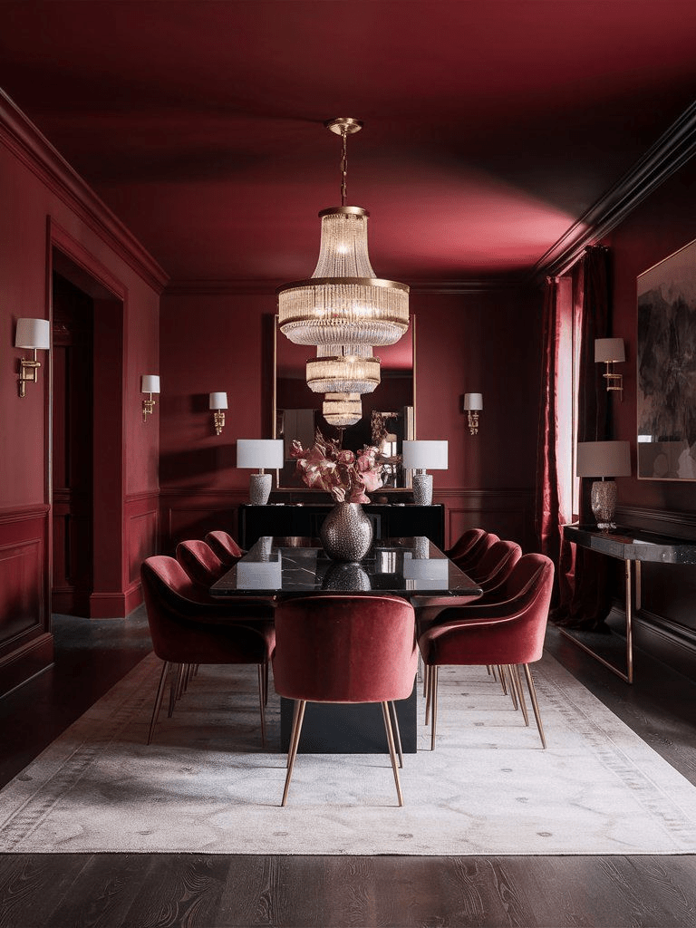
- The Ruby Dining Room
- Small Spaces, Big Impact
- Amethyst Purple: Moody Elegance with Feminine Edge
- The Amethyst Home Office
- Mixing Jewel Tones: Advanced Color Drenching
- The Jewel-Toned Open Concept
- Jewel Tone Accent Walls Done Differently
- Practical Considerations: Making Color Drenching Work
- Room-by-Room Color Drenching Guide
- Common Color Drenching Mistakes to Avoid
- Seasonal Transitions: Beyond Fall
- The Investment: Is Color Drenching Worth It?
- Getting Started: Your Color Drenching Action Plan
- Color Drenching Beyond the Basics
- Final Thoughts: Embracing Boldness This Fall
- FAQ: Your Jewel Tone Color Drenching Questions Answered
- Will a deep jewel tone make my small living room look smaller?
- What are the best complementary accents for sapphire blue interiors?
- How can I prevent my dark emerald green decor from feeling too cold or cave-like?
- Is fall color drenching just a style fad, or is it a long-term luxurious home décor investment?
- What specific paint finish should I use for a high-traffic ruby powder room?
Fall Color Drenching: Rich Jewel Tones That Transform Spaces
There’s something utterly magical about fall. It’s not just the crisp air or pumpkin-spiced everything it’s the invitation to go bold, to embrace depth, to drench your living spaces in color that feels as rich as velvet and as warm as candlelight.
This season, we’re diving headfirst into one of the most captivating trends: fall color drenching with jewel tones.
If you’ve been following along with my late summer transition tips, you know I’m all about creating seamless seasonal shifts. But this?
This is where we take it to the next level transforming entire rooms into immersive color experiences that wrap around you like your favorite cashmere throw.
What Exactly Is Color Drenching?
Color drenching isn’t your grandmother’s accent wall (though I love those too). It’s an all-encompassing design approach where you saturate a space with one dominant hue walls, ceiling, trim, sometimes even floors and furniture. Everything bathes in that color.
The result? Pure magic. It creates depth, eliminates visual boundaries, and makes rooms feel both expansive and incredibly intimate.
When you drench a space in jewel tones specifically, you’re adding layers of sophistication that lighter palettes simply can’t achieve.
Think of it as immersive design. You’re not decorating a room you’re creating an experience, a mood, an entire atmosphere.
Why Jewel Tones Are Perfect for Fall Color Drenching
Jewel tones are having their moment, and honestly, it’s about time. These rich, saturated colors emerald, sapphire, ruby, amethyst carry an inherent luxury.
They’re inspired by precious gemstones, after all, and they bring that same sense of opulence into your home.
But here’s what makes them perfect for fall specifically: they embody the season’s essence. As leaves turn crimson and golden hour light gets that honey-soaked quality, jewel tones mirror nature’s own dramatic transformation. They’re warm without being predictable. Cozy without being cliché.
Plus, they work beautifully with the textures we crave in autumn velvet, wool, brass, dark wood. If you’ve been exploring autumn décor ideas already, jewel tone color drenching takes everything up several notches.
The Psychology Behind Rich, Saturated Colors
Colors affect us profoundly. We know this instinctively why else would a sunny yellow kitchen feel so different from a moody charcoal one?
Jewel tones create spaces that feel protective, intimate, womb-like even. Emerald green has been shown to reduce stress and promote balance.
Deep blues like sapphire encourage calm and contemplation. Ruby reds energize while maintaining sophistication. Amethyst purples inspire creativity and luxury.
When you drench an entire room in these hues, you’re not just changing how it looks. You’re fundamentally altering how it feels to be in that space. It’s transformative in the truest sense.
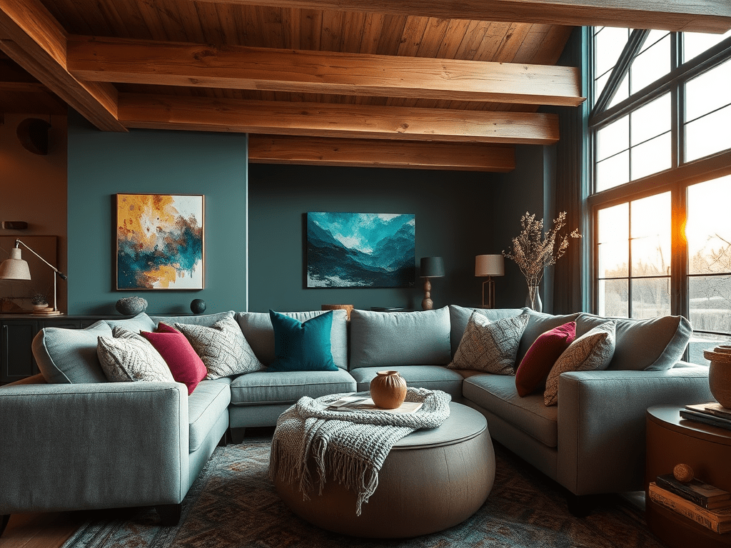
Emerald Green: The Crown Jewel of Fall Color Drenching
Let’s start with emerald arguably the most versatile jewel tone for color drenching. This isn’t your typical sage or mint. We’re talking deep, forest-floor green with blue undertones that shift depending on light.
How to Drench a Room in Emerald
Begin with the walls. Choose a paint with depth something with a slight sheen catches light beautifully. Benjamin Moore’s “Hunter Green” or Farrow & Ball’s “Studio Green” are stunning options. If you’re exploring paint color choices, these are worth serious consideration.
Don’t stop at the walls. Paint the ceiling the same shade. This eliminates that jarring white boundary and makes the room feel taller, more cohesive. Controversial? Maybe. Spectacular? Absolutely.
Add emerald velvet curtains, perhaps these luxurious options from Amazon, and layer in deeper green throw pillows.Bring in natural elements eucalyptus stems in brass vases, dark wood furniture, leather accents in cognac tones.
Lighting Considerations for Dark Jewel Tones
Here’s where people get nervous. “Won’t it feel like a cave?”
Not if you’re strategic with lighting. Multiple light sources at different heights are essential. A statement chandelier, table lamps with warm bulbs, maybe some LED strip lighting tucked behind crown molding for ambient glow.
Mirrors are your secret weapon too they bounce light around and prevent that closed-in feeling. A large antiqued mirror opposite a window? Chef’s kiss.
If you’re looking for the perfect mirror to complement your jewel-toned space, check out my guide to statement wall mirrors that transform any space.
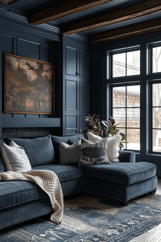
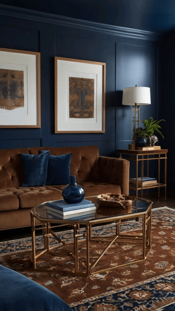
Sapphire Blue: Creating Depth and Tranquility
If emerald is the forest, sapphire is the ocean at twilight. This deep, mysterious blue works gorgeously in bedrooms, libraries, or any space where you want to encourage relaxation and introspection.
Sapphire Bedroom Sanctuary
Imagine this: walls drenched in sapphire, ceiling included. Crisp white bedding creates stunning contrast like whitecaps on dark water. Brass fixtures add warmth. A navy velvet headboard from Amazon grounds the space.
Layer in textures: a chunky knit throw in cream, linen curtains that diffuse morning light, a vintage Persian rug with hints of blue, rust, and gold. Add touches of copper through picture frames, a bedside lamp, decorative objects.
The result feels cocooning but not claustrophobic. It’s the kind of room where you actually want to turn off your phone and simply exist.
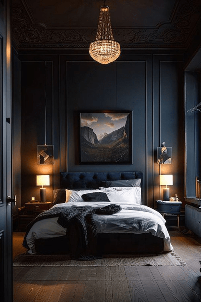
Complementary Colors for Sapphire
While color drenching emphasizes one dominant hue, introducing complementary accents prevents monotony. With sapphire, think:
- Warm metallics (brass, copper, gold)
- Rust and terracotta
- Cream and ivory
- Emerald green for jewel-tone layering
- Mustard yellow for unexpected pop
These work as accent pieces throw pillows, artwork, decorative objects without breaking the drenched effect.
Ruby Red: Bold, Dramatic, Unapologetically Luxe
Ruby is not for the faint of heart. This is the jewel tone that demands attention, that transforms a dining room into something out of a gothic romance novel or a powder room into a jewel box.
The Ruby Dining Room
Picture a dining room where every surface glows with deep, wine-red richness. Walls in a shade like Benjamin Moore’s “Caliente” or Sherwin-Williams’ “Red Bay.” The ceiling too yes, really.
Dark wood table, upholstered chairs in ruby velvet (check out these options on Amazon), brass candlesticks catching flickering light. Artwork with gold frames. A vintage chandelier dripping with crystals.
This is maximalism at its finest. It’s theatrical, yes, but it’s also incredibly intimate. Ruby makes every dinner party feel like an occasion.
Small Spaces, Big Impact
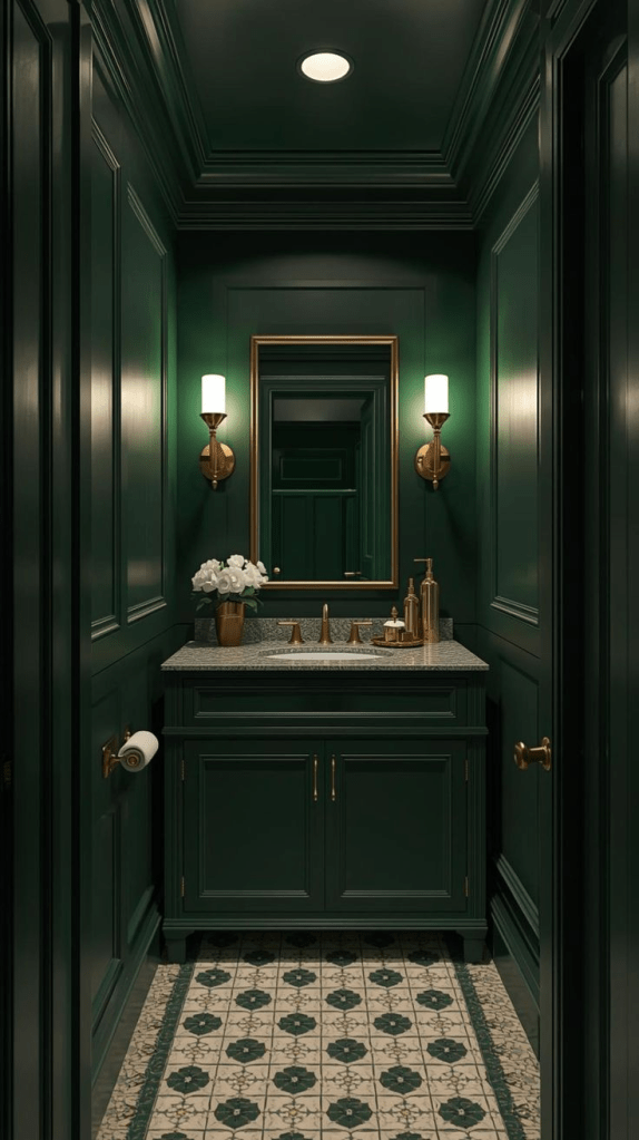
Don’t have a dining room to spare? The powder room is perfect for bold color drenching. Small spaces actually benefit from dark, saturated colors they feel intentional rather than cramped.
A ruby powder room with brass fixtures, a ornate mirror, and perhaps wallpaper with a subtle damask pattern over the paint? Guests will talk about it for months. Add scented candles in brass holders for that final touch.
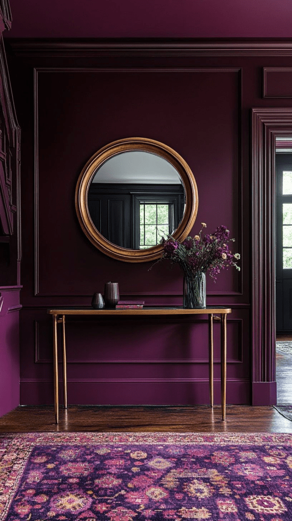
Amethyst Purple: Moody Elegance with Feminine Edge
Amethyst sits between ruby and sapphire it has red’s warmth but blue’s calm. This makes it surprisingly versatile and deeply sophisticated.
The Amethyst Home Office
A home office drenched in amethyst becomes a creative sanctuary. Paint in a shade like Farrow & Ball’s “Pelt” or Benjamin Moore’s “Shadow.”
Layer in rich textures: a purple velvet desk chair, brass desk accessories, deep wood shelving. Art with purple undertones think abstract paintings, vintage botanical prints, anything with movement and depth.
Plants are crucial here. Greenery pops beautifully against purple and keeps the space from feeling too heavy. Consider a fiddle leaf fig in the corner, pothos trailing from shelves, or a dramatic snake plant.
The lighting strategy: warm-toned bulbs exclusively. Cool white will make purple feel cold and uninviting. You want that golden glow that makes everything feel expensive and curated.

Mixing Jewel Tones: Advanced Color Drenching
Once you’re comfortable with single-color drenching, why not layer jewel tones? This is next-level design, but when done thoughtfully, it’s breathtaking.
The Jewel-Toned Open Concept
In open floor plans, use different jewel tones to define spaces without walls. Emerald for the living area, sapphire for the dining nook, amethyst for a reading corner. The transitions happen through furniture and textiles rather than abrupt paint changes.
The trick? Keep a unifying element throughout maybe brass fixtures, or natural wood tones, or cream upholstery. This creates cohesion while celebrating the drama of multiple saturated hues.
Jewel Tone Accent Walls Done Differently
If full drenching feels like too much, try “drenching” architectural features. Paint built-in bookcases emerald while keeping walls neutral. Drench a coffered ceiling in sapphire while walls stay warm white. Paint interior doors ruby in an otherwise neutral hallway.
This gives you the jewel tone impact without the full commitment.
Practical Considerations: Making Color Drenching Work
Let’s talk logistics because beautiful rooms also need to be functional.
Paint Selection and Finish
Not all paints are created equal for color drenching. You want quality paint with excellent pigment saturation and coverage. Cheap paint in dark colors? You’ll need seventeen coats and still see streaks.
Invest in premium paint. Benjamin Moore, Farrow & Ball, Sherwin-Williams their formulations are designed for this. Yes, it costs more upfront, but you’ll use less paint and get better results.
As for finish: eggshell or satin work beautifully for most jewel tones. They have just enough sheen to reflect light without looking glossy. Flat finishes absorb too much light in dark colors, making rooms feel dim.
If you’re on a budget and most of us are check out my budget home décor guide for tips on achieving high-end looks without breaking the bank.
Testing Before Committing
Never, ever skip the sample stage. Paint large swatches (at least 2×2 feet) on different walls. Observe them at various times of day morning light, afternoon sun, evening lamplight.
Colors shift dramatically depending on natural light exposure. That gorgeous emerald might look muddy on a north-facing wall. The sapphire that sang in the store might feel navy-black in your actual space.
Live with those samples for at least a week. Seriously. Your future self will thank you.
Styling Your Color-Drenched Space
The paint is just the beginning. Now comes the fun partbringing in furnishings and décor that make your jewel-toned space sing.
Textiles and Textures
Jewel tones demand texture. Flat surfaces in these colors can feel one-dimensional. But add velvet? Linen? Boucle? Silk? Now you’re creating depth and visual interest.
Layer, layer, layer. A velvet sofa in your room’s jewel tone, linen curtains that diffuse light, wool throw blankets, silk pillow covers catching light differently than surrounding velvet. Each texture interacts with color uniquely.
Don’t forget the floor. A plush area rug in complementary tones grounds the space and adds another textural layer.
Metallics: The Perfect Contrast
Brass, copper, and gold are jewel tones’ best friends. They add warmth and catch light in ways that prevent dark rooms from feeling heavy.
Think brass picture frames, copper planters, gold-leafed mirrors, bronze sculptures. Even hardware matters swap out standard doorknobs and drawer pulls for brass alternatives.
Silver and chrome? Generally less successful with jewel tones. They read too cold against these warm, rich hues.
Art and Accessories
Your artwork should work with your color-drenched walls, not fight them. This doesn’t mean matchy-matchy it means thoughtful curation.
Abstract pieces with your jewel tone plus complementary colors work beautifully. Black and white photography creates stunning contrast. Vintage botanical prints in ornate frames add sophistication.
For accessories, embrace the “more is more” philosophy within reason. A single decorative object on a ruby credenza looks lonely. Three objects of varying heights a brass candlestick, a stack of leather-bound books, a small sculpture creates visual interest.
Room-by-Room Color Drenching Guide
Let’s get specific about which jewel tones work best in different spaces.
Living Rooms
Emerald or sapphire work beautifully here. These colors create sophisticated backdrops for entertaining while feeling cozy for everyday living.
Keep furniture in neutral tones with jewel-tone accents, or go bold with a jewel-toned sectional that melts into the walls. Add plenty of lighting floor lamps, table lamps, maybe a statement chandelier.
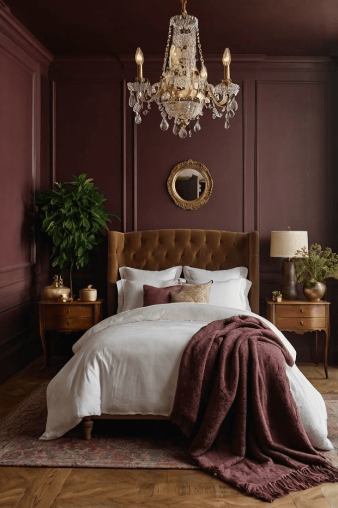
Bedrooms
Sapphire creates the ultimate sleep sanctuary. Amethyst works beautifully in guest rooms or primary bedrooms where you want sophistication with a softer edge.
Ruby? Only if you love drama and aren’t sensitive to stimulating colors before sleep. Some people find it energizing, others cozy know yourself.
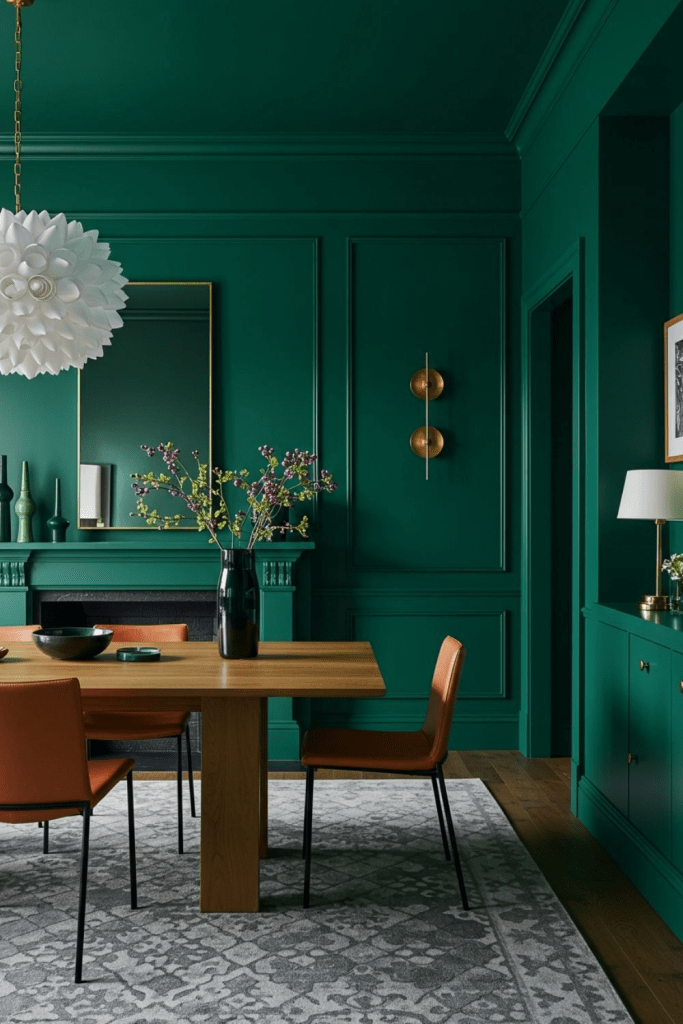
Dining Rooms
Ruby and emerald both create stunning dining experiences. These are special occasion spaces where drama is not only acceptable but encouraged.
Add velvet dining chairs, brass light fixtures, and artwork that makes dinner guests crane their necks.
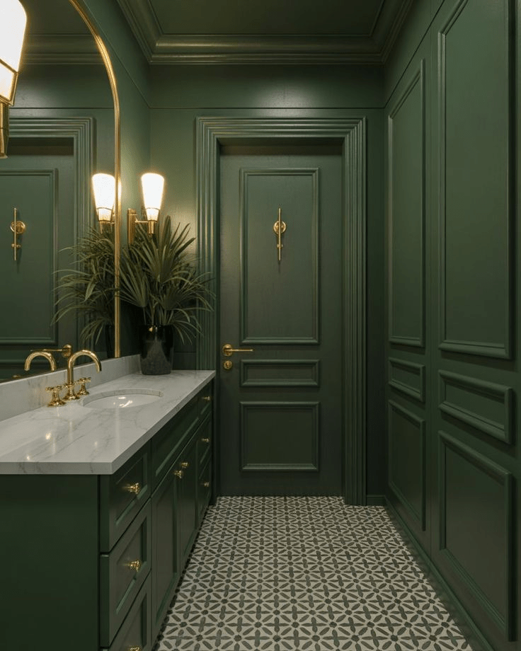
Bathrooms
All jewel tones work in bathrooms, especially powder rooms where you can go dramatic without worrying about daily functionality.
Sapphire creates spa-like serenity. Emerald feels fresh and luxurious. Ruby or amethyst turns a powder room into a jewel box.
Add brass fixtures, a stunning mirror, luxury hand towels in complementary colors, and maybe marble countertops for ultimate luxury.
Common Color Drenching Mistakes to Avoid
Let’s talk about what not to do.
Skipping the Ceiling
I’ve said it before, I’ll say it again: paint that ceiling. White ceilings in color-drenched rooms create harsh boundaries that break the immersive effect. You’ve come this far commit fully.
Inadequate Lighting
Dark walls require intentional lighting strategy. One overhead fixture won’t cut it. You need multiple sources at different heights creating pools of light throughout the space.
Forgetting About Scale
Small rooms can absolutely handle jewel tones, but furniture scale matters even more. Don’t crowd a sapphire bedroom with oversized furniture. Choose pieces that allow the color to breathe.
Ignoring Undertones
Every jewel tone has undertones blue, red, brown, gray. These undertones must work with your home’s existing elements (flooring, trim, adjacent rooms). Test extensively to ensure harmony.

Seasonal Transitions: Beyond Fall
While we’re focusing on fall color drenching, these jewel tones are sophisticated enough to work year-round with seasonal accessory swaps.
For winter, add faux fur throws, evergreen branches, deeper metallic accents. Spring calls for fresh flowers, lighter textiles, introducing more whites and creams. Summer? Linen everything, with artwork swapped for lighter, brighter pieces.
The beauty of jewel tone color drenching is its versatility. The backdrop stays dramatic and luxurious while accessories shift with seasons.
The Investment: Is Color Drenching Worth It?
Let’s be honest this isn’t a weekend DIY for most people. Quality paint costs money. Professional painters cost more. All those gorgeous textiles and accessories? They add up.
But here’s what you’re really investing in: a transformative living experience. You’re creating spaces that make you feel something every single time you walk into them. Spaces that guests remember. Spaces that elevate your daily life.
If you’re strategic maybe drenching one room to start, shopping vintage for accessories, DIYing what you can it’s absolutely achievable without a celebrity designer budget.
Getting Started: Your Color Drenching Action Plan
Ready to transform your space? Here’s how to begin:
Week 1: Choose your room and jewel tone. Order paint samples and test extensively.
Week 2: Plan your lighting strategy. What fixtures need upgrading? Where are gaps in coverage?
Week 3: Source key furniture pieces that velvet sofa, those dining chairs, the statement rug.
Week 4: Prep and paint. If hiring professionals, this is the week. If DIYing, block out adequate time and prepare properly.
Week 5-6: Style and accessorize. This is the fun part where your vision comes together.
Don’t rush. Great design takes time, iteration, living with choices before committing. But the payoff? Absolutely worth every minute.
Color Drenching Beyond the Basics
If you’re hungry for even more color drenching strategies and room-specific guidance, I’ve put together an extensive room-by-room transformation guide that dives deeper into the technique across every space in your home.
Final Thoughts: Embracing Boldness This Fall
There’s something revolutionary about choosing bold, saturated color in a world that often plays it safe with grays and beiges. Color drenching with jewel tones isn’t just a design trend—it’s a statement about how we want to live, how we want to feel in our homes.
This fall, as you’re thinking about seasonal transitions and cozy spaces, consider going deeper than expected. Drench a room in emerald and watch how it changes your mood. Create a sapphire sanctuary that helps you decompress. Build a ruby dining room that turns Tuesday night dinner into an event.
These rich jewel tones transform more than spaces they transform how we experience home. And isn’t that what great design is really about?
Ready to take the plunge? Start small if needed, but start. Your perfectly drenched jewel-toned room is waiting to emerge.
What jewel tone are you most drawn to? Are you team emerald, sapphire, ruby, or amethyst? Drop a comment below I’d love to hear about your color drenching plans!
FAQ: Your Jewel Tone Color Drenching Questions Answered
I know diving into color drenching especially with dramatic jewel tones can feel intimidating. Here are answers to the most common questions I receive from readers like you who are ready to transform their spaces but need a little guidance first.
Will a deep jewel tone make my small living room look smaller?
This is the most common fear, and I totally get it. But here’s the truth: deep jewel tones can actually make small spaces feel more expansive when done correctly.
The key is committing fully painting walls and ceiling in your chosen jewel tone eliminates visual boundaries that make rooms feel choppy and confined.
When everything is drenched in emerald or sapphire, your eye doesn’t know where walls end, creating an envelope effect that feels intimate rather than cramped.
Pair your color drenching with strategic lighting (multiple sources at different heights), mirrors to bounce light around, and keep furniture scaled appropriately.
A small emerald living room with a streamlined sofa, brass floor lamp, and large mirror? Absolutely stunning and not at all claustrophobic.
I’ve seen 10×12 rooms transformed with jewel tone color drenching that feel like luxurious cocoons rather than tiny boxes. It’s all about execution.
What are the best complementary accents for sapphire blue interiors?
Sapphire is incredibly versatile, which is why it’s one of my favorite jewel tones for color drenching. The best complementary accents create warmth and prevent the space from feeling too cool or monochromatic.
Warm metallics are essential brass, copper, and gold all sing against sapphire. Think brass table lamps, copper planters, gold-framed mirrors.
Rich earth tones provide gorgeous contrast: rust, terracotta, warm caramel, cognac leather. These add depth without fighting your sapphire backdrop.
Cream and ivory textiles linen curtains, wool throws, cotton bedding keep things from feeling heavy while maintaining sophistication.
For a more adventurous approach, layer in emerald green accents (yes, mixing jewel tones!). A sapphire room with emerald velvet pillows and brass accents? Chef’s kiss.
The color palette feels cohesive because both are jewel tones, but there’s enough variation to keep things interesting.
How can I prevent my dark emerald green decor from feeling too cold or cave-like?
Lighting strategy is absolutely key here, and it’s where most people stumble with dark color drenching.
First, multiple light sources are non-negotiable. You need ambient lighting (overhead fixture or recessed lights), task lighting (table lamps, floor lamps), and accent lighting (picture lights, LED strips behind crown molding). Each layer serves a purpose and prevents that cave feeling.
Second, warm-toned bulbs only. Cool white or daylight bulbs will make emerald feel harsh and cold. You want 2700K-3000K bulbs that cast that golden, warm glow. This single change transforms how emerald green reads in a space.
Third, reflective surfaces are your friends. Brass and copper fixtures, mirrors (especially large ones opposite windows), glass surfaces these all bounce light around and keep the room feeling open.
Finally, natural elements warm up emerald beautifully. Wood tones (walnut, oak, teak), leather furniture, plants with interesting foliage, woven baskets these organic textures prevent emerald from feeling sterile or overly formal.
I’ve never seen a properly lit emerald room feel cave-like. It’s always a lighting issue, not a color issue.
Is fall color drenching just a style fad, or is it a long-term luxurious home décor investment?
Great question, and one that matters when you’re investing in quality paint, furnishings, and professional installation.
Here’s my honest take: color drenching itself is a technique, not a trend. It’s been used for centuries in different forms think English country homes with green libraries, Victorian parlors in rich burgundy, mid-century spaces with wall-to-wall color.
What changes are the specific colors in favor at any given moment. Jewel tones have staying power because they’re inherently sophisticated and timeless.
A sapphire dining room won’t look dated in five years the way, say, millennial pink might.
That said, maximalist approaches to color drenching may ebb and flow in popularity. But even if minimalism comes back around, a well-executed jewel-tone room still reads as intentional and luxurious rather than dated.
If you love it, it’s worth the investment. Design your home for yourself, not for hypothetical future buyers or Instagram trends.
A color-drenched jewel tone space that makes you genuinely happy every day? That’s never wasted money.
Plus, paint can always be changed if you tire of it (though I suspect you won’t). The technique and the principles you learn lighting, scale, texture layering those translate to any design style.
What specific paint finish should I use for a high-traffic ruby powder room?
Powder rooms are perfect for color drenching because they’re small enough to be dramatic without overwhelming your entire home. For a ruby powder room specifically, finish selection really matters.
Satin or semi-gloss finishes work best in powder rooms for several reasons:
First, they’re more durable and washable than flat or eggshell finishes crucial in a space where guests touch walls (light switches, closing doors) and splashes happen.
Second, they have enough sheen to reflect light, which prevents ruby from feeling too dark or oppressive in a small, often windowless space. That subtle glow makes the color feel rich and jewel-like rather than flat.
Third, they highlight architectural details beautifully. If you have any molding, paneling, or texture in your powder room, a satin finish catches light and creates shadow play that adds dimension.
For paint brands, I recommend Benjamin Moore’s “Aura Bath & Spa” in satin finish it’s specifically formulated for high-humidity spaces and has incredible depth of color. Sherwin-Williams’ “Emerald” line in satin is also excellent.
One pro tip: paint a sample board in your chosen ruby with your chosen finish and live with it in the powder room for a few days.
Observe how it looks under your specific lighting. Ruby can shift between wine-red and burgundy depending on light, and the finish affects this significantly.
Add brass fixtures and a stunning mirror, and you’ve got yourself a jewel box powder room that guests will absolutely love.
Follow, Share and Suscribe!
Related Reading:
- Color Drenching Your Home: The Complete Room-by-Room Interior Design Transformation Guide
- Late Summer Transitions: Preparing Your Decor for Fall
- Transform Your Home: Top 10 Autumn Decor Ideas
- Budget Home Decor DIY: The Ultimate Guide That Actually Works 2025
- The Ultimate Guide to Choosing the Best Paint Colors for Your Home
