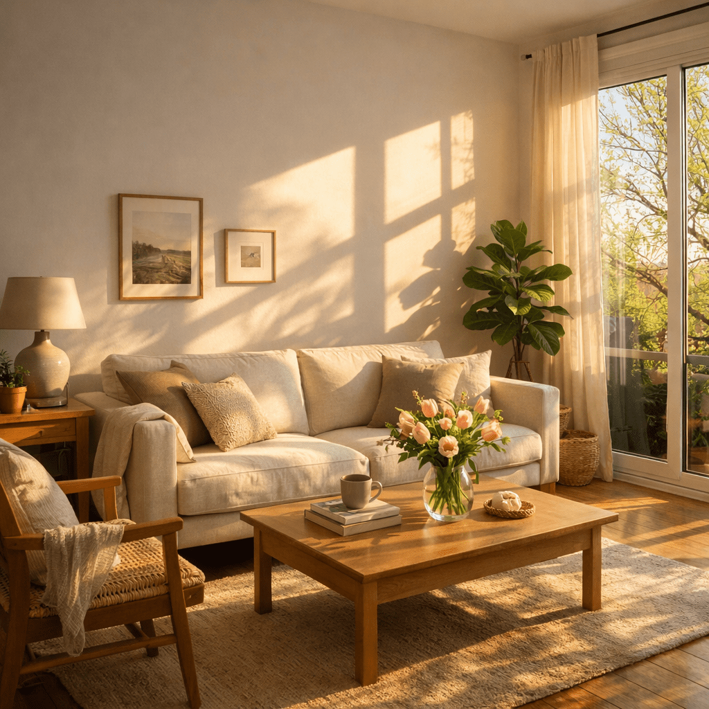
And yet there it is. That unmistakable, slightly sickening golden tinge creeping across walls you know are white. Or at least, they were white in January.
Welcome to one of the most baffling and undertalked phenomena in interior design: metamerism meets April sun. It happens every spring, to thousands of perfectly content homeowners, and almost nobody talks about it until it’s too late. Let’s change that.
What Is Metamerism? (And Why Should You Care Right Now)
Metamerism sounds like something a physicist invented to ruin your decorating weekend. Technically, it’s the phenomenon where two colors appear to match under one light source but look completely different under another.
Here’s the part that matters for your walls: your paint has multiple pigments in it. Mixed together. Some of those pigments sit dormant under cool winter light completely invisible, totally inert. Then April arrives, the sun climbs higher in the sky, the angle of light sharpens, and suddenly those sleepy yellow or orange undertones wake up.
Your paint hasn’t changed. The light has.
That creamy, sophisticated “Warm White” you chose? It was formulated with a base that likely contains traces of yellow ochre, raw umber, or red iron oxide all of which are activated by strong, high-angle, warm-spectrum daylight. And April? April is basically peak undertone-activation season.
Why April Specifically? The Science of Spring Light
This isn’t random. There’s a reason this doesn’t happen in December.
In winter, the sun sits low on the horizon. Light enters your windows at a steep, raking angle long and cool, skewing toward the blue-gray end of the spectrum. Many undertones hide beautifully under this kind of illumination. Which is exactly why you loved that paint color when you chose it in November.
By April, everything shifts. The sun is now sitting high 50 to 60 degrees above the horizon in many latitudes and the light flooding your rooms is stronger, more direct, and warmer in color temperature. South-facing and west-facing rooms get hit hardest, but even east-facing spaces feel the change in morning hours.
The result? That warm, high-angle spring light hits your wall at the perfect angle to illuminate every yellow, gold, or peachy undertone hiding inside your paint. Metamerism does the rest.
I’ve written about similar lighting-triggered disasters before specifically how the cool, flat quality of north-facing light makes blue paint shift toward purple. This is essentially the reverse problem. Same villain. Different season.
Is It the Paint, the Light, or Both?
Both. Always both. But let’s break it down.
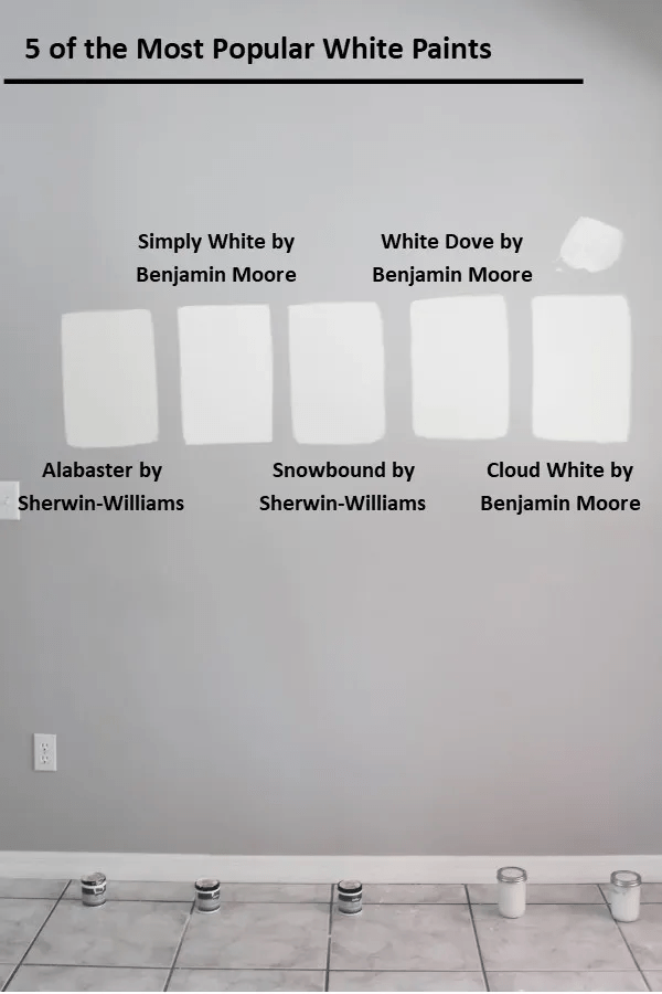
The Paint Side: Hidden Undertones in “Neutral” Whites
Walk into any paint store and you’ll find dozens of whites described as “warm,” “creamy,” “soft,” or “natural.” Sounds harmless. But those descriptors exist because those whites contain colorants and those colorants have undertones that perform differently depending on lighting conditions.
The most common yellow-triggering undertone culprits in popular warm whites:
- Yellow ochre — earthy, golden, beautiful in candlelight, catastrophic under strong April sun
- Raw umber — adds warmth and depth, but activates orange-yellow in direct sunlight
- Red iron oxide — in small doses, it “warms” a white; in high spring light, it shunts toward peach or yellow
- Green undertones gone wrong — some “warm whites” have a subtle green base that, paired with warm sunlight, reads as yellow-green or even lime
The tricky part? None of this is visible when you’re holding a paint chip under the fluorescent lights of a hardware store. Or even in your home during a grey winter afternoon.
The paint was always yellow. You just couldn’t see it yet.
The Light Side: South-Facing Rooms Are Ground Zero
Not all rooms suffer equally. South-facing rooms receive the most direct sunlight for the longest duration throughout the day. West-facing rooms catch the golden late-afternoon light the warmest light of all. If you’ve painted either of these in a warm white, you’ve essentially handed April a megaphone to broadcast every undertone your paint contains.
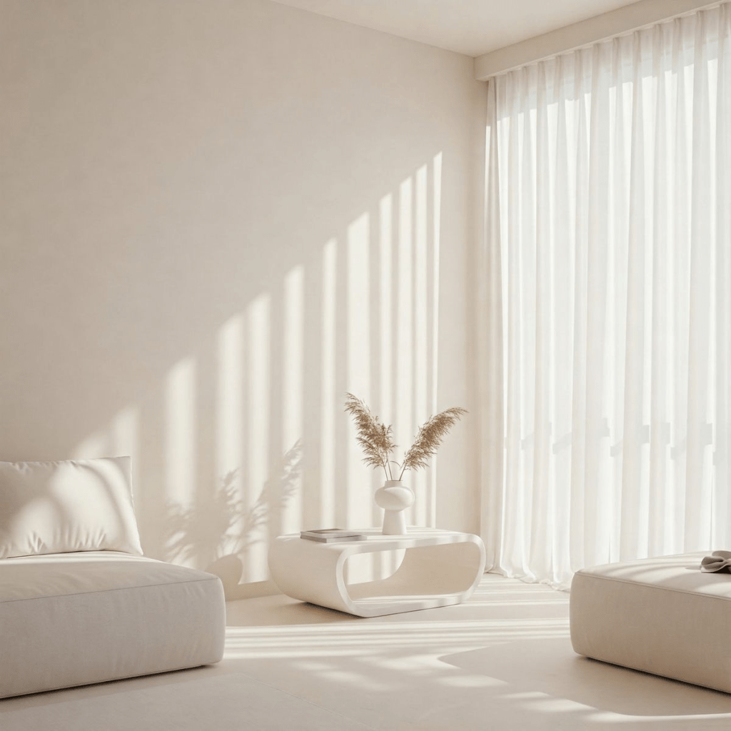
North-facing rooms? Usually fine, ironically. The cool, diffused light in those rooms actually suppresses yellow undertones.
If your warm white walls turned yellow in spring: Start by switching to cooler LED bulbs (3000K-4000K) in south and west-facing rooms. Add cool-toned accents think linen, soft grey, or sage to neutralize visual warmth. Test paint swatches in April daylight before repainting. For a permanent fix, choose a white with blue, green, or grey undertones and an LRV above 75.
How to Fix Yellow Undertones in White Paint: Spring Light Edition
Step 1: Diagnose Before You React
Before you grab a roller, pause. Is the yellow coming from one wall or all of them? Does it appear at a specific time of day (hello, 2pm south-facing wall)? Does it look worse against your trim or your flooring?
Answering these questions tells you whether you’re dealing with true metamerism (light-triggered undertone activation) or something else entirely like a low-quality paint with poor pigment stability, or a primer that’s bleeding through.
The test: Take a white piece of printer paper and hold it against your wall in the “yellow” zone. If the paper looks noticeably cooler and brighter, your paint is genuinely warmer than it should be. If they match, the issue might be your lighting, not the paint itself.
Step 2: Adjust Your Artificial Lighting First (It’s Free)
This is the fastest, cheapest fix that nobody talks about. Most people reach for the paint roller when they should reach for a light bulb.
If you’re using warm LED bulbs (2700K) in a south-facing room that already receives warm spring light, you’re essentially double-dipping on warmth. Swap to bulbs in the 3000K–4000K range for a cleaner, more neutral light that won’t amplify those yellow undertones further.
Add directional lighting a table lamp in the corner, a floor lamp near a cooler north-facing wall to create visual counterbalance and pull the eye away from the problem wall.
Step 3: Use Color to Fight Color
You’d be surprised how much your surrounding decor influences how that wall reads. Adding cool-toned elements into a yellowed room creates perceptual contrast that calms the warmth down significantly.
Think: slate blue throw pillows, cool grey linen curtains, a eucalyptus green plant, white oak flooring with minimal orange tones, or cool-white trim paint. None of these change the wall. But they change what your brain decides the wall looks like.
This is exactly why color drenching works so powerfully when you intentionally layer tones throughout a space, you control the overall temperature story the room tells.
Step 4: If You’re Repainting Choose Smarter
So you’ve decided the paint has to go. I get it. Here’s how to make sure you don’t end up back in the same yellow trap six months later.
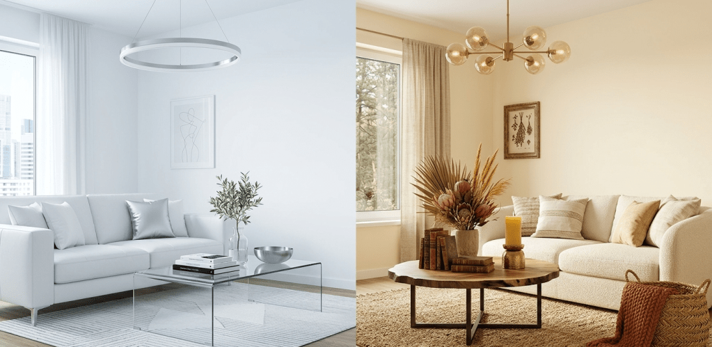
The golden rule for south and west-facing rooms: Choose whites with blue, grey, or green undertones. These cool undertones will be counteracted by the warm spring light, landing you closer to a true neutral white than a warm white ever could.
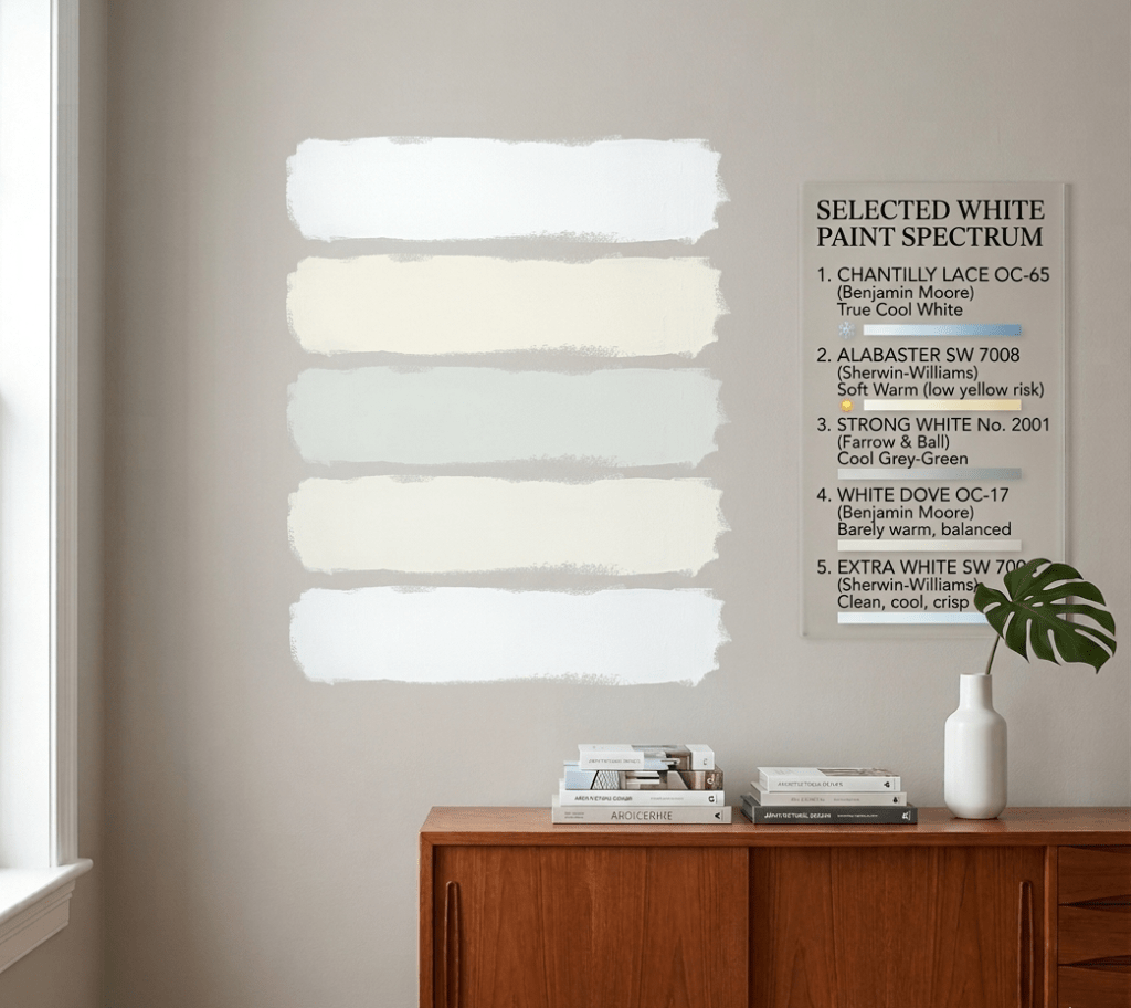
Top picks that resist the yellow spring shift:
| Paint Name | Brand | Undertone | LRV | Best Room Type |
|---|---|---|---|---|
| Chantilly Lace OC-65 | Benjamin Moore | True Cool White | 92 | South/West facing |
| Alabaster SW 7008 | Sherwin-Williams | Soft Warm (low yellow risk) | 82 | Balanced light rooms |
| Strong White No. 2001 | Farrow & Ball | Cool Grey-Green | 80 | Any exposure |
| White Dove OC-17 | Benjamin Moore | Barely warm, balanced | 85 | Universal |
| Extra White SW 7006 | Sherwin-Williams | Clean, cool, crisp | 86 | High-sun rooms |
Notice something? The highest LRV values the brightest whites tend to have the least undertone saturation. Less pigment means less metamerism. When in doubt, go lighter and cooler.
And this applies far beyond just whites. Choosing the best paint colors for your home always starts with understanding your light not your mood board.
Step 5: Test in April Light. Non-Negotiable.
If you’ve made it this far and you’re heading back to the paint store, please do me one favor: test your samples in April, in your actual room, over at least 72 hours.
Paint a 12×12 inch swatch directly on the wall. Observe it at 8am, at noon, at 4pm, and under your artificial lighting at 9pm. Take photos. Compare them side by side. What looks absolutely perfect at 7am can look like a banana at 2pm.
This is the single step that would have saved you from the current yellow wall situation. Don’t skip it twice.
The Metamerism Problem in Whole-Room Color Schemes
Here’s where it gets more nuanced and more interesting.
If you’ve embraced color drenching for spring, you’re working with carefully layered tones across walls, ceilings, and trim. Metamerism doesn’t just affect one wall in that scenario it can shift the entire tonal balance of your room when the season changes.
A monochromatic white scheme where walls, ceiling, and trim are all slightly different versions of “warm white”? In spring light, those tiny undertone differences get amplified. Suddenly the ceiling looks yellow-green while the walls look gold while the trim reads almost cream. What felt cohesive in February looks chaotic in April.
The fix here isn’t to abandon the monochromatic approach it’s to be smarter about undertone consistency. If you’re color drenching in a white family, choose whites that share the same undertone direction, so when spring light activates those undertones, everything shifts together rather than apart.
I covered how this works in smaller, more challenging spaces in my color drenching for small spaces guide the same logic applies: undertone cohesion is what makes a monochromatic scheme feel intentional rather than accidental.
When Yellow Undertones Are the Problem And When They’re the Paint
There’s one more scenario worth addressing, because it’s more common than you’d think.
Sometimes the yellow isn’t metamerism. Sometimes it’s one of these:
Nicotine or smoke staining bleeding through inadequately primed walls. This produces an amber-yellow that looks uniform and is worse near ceilings.
Water damage leaving mineral deposits that discolor paint from within. Usually patchy and irregular.
Cheap paint with poor pigment dispersion the yellow pigment literally separates over time, especially on south-facing walls that experience repeated heating and cooling cycles.
A primer that wasn’t tinted, allowing the original wall color (or stain) to influence the topcoat.
If your yellow appeared suddenly after months of stability, or if it’s uneven and blotchy rather than uniform, you’re not dealing with metamerism. You’ve got a different problem entirely and the fix starts with the wall prep, not the paint color.
A Designer’s Honest Take
I’ll be real with you: the paint industry is not always your friend when it comes to undertones.
“Warm white” is a category, not a specification. It tells you the direction of the undertone but says nothing about its intensity, its pigment composition, or how it will behave across a full year of changing light. Paint names are marketing tools. The chip is just a starting point.
After years of experimenting in my own spaces and studying how light interacts with color through every season, my number one piece of advice is this: treat your light as a permanent fixture in your room. It’s as real and influential as your sofa or your floors. Design around it, not despite it.
Your walls aren’t misbehaving. They’re responding to physics, perfectly and predictably. Your only job is to know the rules before you pick up the brush.
FAQ: Yellow Undertones in White Paint Spring Light
Q: Why does my white paint look yellow only in certain rooms? Because those rooms receive stronger, more direct spring sunlight typically south or west-facing spaces. The yellow undertones in your paint are activated by the warm, high-angle light unique to those exposures.
Q: Can I fix yellow undertones without repainting? Yes, in many cases. Swap warm LED bulbs for 3000–4000K bulbs, add cool-toned textiles and decor, and consider cool-tinted sheer curtains to filter direct sunlight. These won’t eliminate the undertone but they can dial it back significantly.
Q: What white paints have no yellow undertones? Look for whites described as “crisp,” “clean,” or with “grey” or “blue” undertones. Chantilly Lace (Benjamin Moore), Extra White (Sherwin-Williams), and Strong White (Farrow & Ball) are consistently reliable in high-sun rooms.
Q: Does paint finish affect how yellow the undertone looks? Absolutely. Flat and matte finishes absorb light and tend to intensify undertones. Eggshell and satin reflect more light, which can diffuse undertone saturation slightly. For high-sun rooms, an eggshell finish is generally preferable.
Q: Will the yellow go away in summer or autumn? Partially. As the sun angle changes through the year, the undertone activation will vary. But if your paint has strong yellow pigments, they won’t disappear entirely — they’ll just become more or less visible depending on the season.
Final Thoughts: Spring Light Reveals Everything
April is ruthless. It’s the season of truth for gardens, wardrobes, and paint colors alike.
The phenomenon of metamerism in spring light is one of those design realities that most people discover after they’ve made their paint decision. My goal with Linda Designs has always been to put that knowledge before the decision, not after the regret.
If you’re sitting in a room right now wondering why everything looks vaguely yellowish and slightly wrong it’s not you, it’s not the paint brand, and it’s not some defect. It’s physics, doing what physics does.
Now you know what’s happening, why it’s happening, and exactly how to fix it. Whether you adjust your lighting, rethink your decor, or pick up a pot of Chantilly Lace this weekend you’ve got the tools.
Go make your walls behave.
Struggling with another paint color mystery? Check out how spring works its tricks on the full color wheel — from pastel monochromatic schemes that avoid the Easter-egg effect to bold, deep tones that hold their own all year long. Drop your color questions in the comments — I read every single one.
