- Why Everything You’ve Been Told About Small Rooms Is Incomplete
- What Is “Monochrome Depth” And Why Small Spaces Need It
- The Small Space Struggle And Why Standard Advice Fails
- How to Execute Monochrome Depth in a Small Room Step by Step
- The Best Color Families for Small-Space Drenching
- What NOT to Do: Common Mistakes That Undermine the Effect
- Real-Room Applications: Where to Start
- Final Thoughts: Small Is Not a Problem to Solve
Let me say something that contradicts almost every piece of decorating advice you’ve ever read.
Paint your small room dark.
I know. It sounds insane. Every magazine, every Pinterest board, every well-meaning friend has told you the same thing: light walls make a room feel bigger. And yet, here I am a designer enthusiast who has spent years obsessing over color theory, studying transformations, and diving deep into what actually works telling you that the most transformative thing you can do for a cramped space is to drench it in color. One rich, immersive, beautifully layered color.
This is the “Information Gain” moment: what you think you know about small spaces is only half the story.
Why Everything You’ve Been Told About Small Rooms Is Incomplete
Here’s the problem with the “light walls only” rule. It’s not wrong, exactly but it’s wildly oversimplified.
White walls in a small room create contrast. Contrast = visible edges. Visible edges = defined boundaries. And defined boundaries? They make a room feel exactly as small as it is.
Now flip that. When you wrap a room in a single, cohesive color ceiling, walls, trim, skirting boards, even the door something remarkable happens. The edges dissolve. The eye can no longer trace where one surface ends and another begins. The room stops feeling like a box and starts feeling like an atmosphere.
💡 The Edge-Dissolving Rule: When you wrap a room in a single color including the ceiling and trim the eye can no longer trace boundaries. The room stops feeling like a box and starts feeling like an atmosphere. This is the entire premise of color drenching.
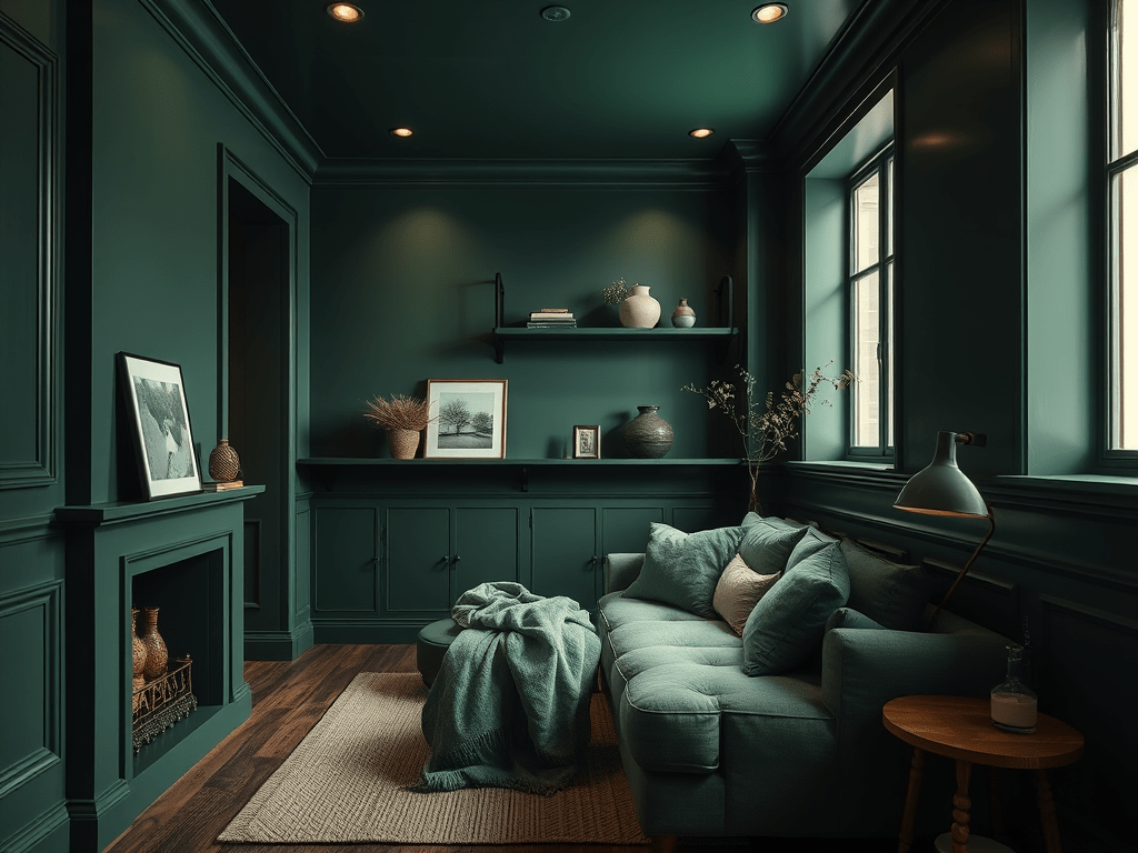
That’s color drenching. And when done with monochrome depth using multiple tones, textures, and finishes within a single color family it becomes something even more powerful.
I’ve explored the full technique in my complete color drenching room-by-room transformation guide, which is worth bookmarking if you’re just discovering this trend. But today? We’re laser-focused on the small space problem because it’s the scenario where color drenching is most misunderstood and, when done right, most jaw-dropping.
What Is “Monochrome Depth” And Why Small Spaces Need It
Monochromatic design is not the same as using one flat color everywhere. That’s a common misconception and it’s what makes people nervous.
Monochrome depth means building a tonal world. One color family. Many expressions of it.
Think of forest green: a matte sage on the walls, a deeper olive on the built-in shelves, a glossy bottle green ceiling that reflects light downward, a dusty celadon throw on the linen sofa. Every surface belongs to the same color story, but each one has its own character, finish, and weight.
This layering does three things simultaneously in a small room:
- Creates visual complexity without introducing competing colors that would “chop” the space
- Guides the eye on a journey rather than letting it slam into a white wall
- Adds perceived depth the same way a forest feels more expansive than an open field
The goal isn’t decoration. It’s spatial illusion. And it works.
The Small Space Struggle And Why Standard Advice Fails
Small spaces have a very particular design problem. They don’t just look small. They feel small in a way that affects how you live in them how relaxed you feel, how long you stay, whether you feel cozy or claustrophobic.
Most decorating advice for compact rooms goes like this: neutral walls, light furniture, mirrors, multi-functional pieces, keep it minimal. Safe. Sensible. And often… soul-crushingly boring.
The deeper issue? Those rules treat small rooms as problems to be minimized rather than spaces to be celebrated. Color drenching rejects that framework entirely.
It says: let this room be exactly what it is small, intimate, enveloping and make that the whole point.
The “Box Problem” How Visible Boundaries Shrink a Space
When walls, ceiling, trim, and floor are all different colors or tones, your brain processes the room as a series of separate planes. You can see the ceiling end and the wall begin. You can see the baseboard divide floor from wall. Each transition is a visual interruption a reminder that the room is contained.
Color drenching erases those interruptions. The room becomes one continuous envelope. And envelopes, interestingly, feel much larger than boxes.
How to Execute Monochrome Depth in a Small Room Step by Step
Ready to try it? Here’s how I approach this as a designer enthusiast, working room by room with real constraints and real budgets.
Step 1: Choose Your Anchor Color Wisely
Not every color works equally well for small-space drenching. The best candidates share a few qualities:
Mid-depth tones outperform extremes. Very pale colors don’t drench they just look white-ish. Very dark colors can work beautifully (moody navy studies are a masterclass), but they require more light management. For beginners, start in the mid-range: warm terracotta, dusty mauve, deep sage, rich caramel, soft slate.
Warm undertones advance; cool undertones recede. If you want the room to feel cozy-small, go warm. If you want it to feel expansive-small, lean cool and blue-grey.
Test before you commit. Paint large A4 swatches on multiple walls and live with them for 48 hours across different lighting conditions. Morning light, evening lamp light, overcast afternoon the color will shift dramatically. I have a detailed breakdown of this process in my ultimate guide to choosing the best paint colors for your home, which covers undertones, lighting, and finish selection in depth.
Step 2: Build Your Tonal Palette (At Least Three Depths)
Once you have your anchor color, you need three tonal expressions:
The lightest tone: for ceiling and upper walls. Going even one shade lighter here draws the eye upward and creates the illusion of height. Just one shade. Not white. Never white if you’re drenching.
The anchor tone: for walls. This is your primary color, your mid-tone truth.
The deepest tone: for trim, built-ins, window frames, and architectural details. This is counterintuitive (we’re taught to paint trim white), but painting trim in a deeper version of your wall color is one of the most effective visual tricks in the small-space designer’s toolkit. It makes the walls appear to recede, adding depth.
Step 3 : Think in Finishes, Not Just Colors
This is where monochrome depth becomes truly sophisticated. Different paint finishes reflect light differently and in a drenched room, that variation is your texture.
- Flat/matte: Absorbs light. Makes surfaces feel soft, intimate, almost fabric-like.
- Eggshell: A gentle sheen that adds warmth without shine.
- Satin: Mid-gloss. Excellent for trim and doors; reflects light just enough to define edges subtly.
- High-gloss: On a ceiling, this is transformative. A glossy ceiling in your accent color reflects light downward like a mirror, visually expanding floor-to-ceiling height in a way nothing else can.
Don’t be afraid to use four finishes in the same color family on different surfaces. That’s the point.
🎨 Quick-Reference: The Monochrome Depth Finish Guide
| Surface | Recommended Finish | Why It Works for Drenching |
|---|---|---|
| Walls | Flat / Matte | Absorbs light to make boundaries disappear |
| Trim & Doors | Satin / Eggshell | Provides just enough definition to keep the room from looking “flat” |
| Ceiling | High-Gloss | The Game Changer: Reflects light downward to “lift” the ceiling height |
| Built-ins | Semi-Gloss | Adds architectural depth within the same color family |
💡 Designer Note: This single table is your shortcut to avoiding the most common color drenching mistake using the same flat finish on every surface. Variation in sheen is your texture.
Step 4: Extend the Drench Into Soft Furnishings
Paint is the foundation. But the drench doesn’t stop at the walls.
Layer in textiles, furniture, and objects that live within your color family. A deep sage room becomes exponentially more immersive when the linen curtains are a dusty celadon, the velvet cushions are forest green, and the lampshade is moss.
This is also where furniture material matters enormously. Texture within a monochromatic scheme prevents it from feeling flat or sterile. I’ve been researching sustainable upholstery options lately if you’re considering furniture renewal as part of your room transformation, the emerging mushroom leather furniture durability reviews are fascinating reading.
Mycelium-based leathers offer a beautifully matte, organic surface that holds tone exceptionally well and layers beautifully into drenched interiors without competing visually. Unlike traditional leather, the subtle grain variation adds depth within your monochrome palette exactly what a drenched room needs.
For a small drenched room, furniture with visual lightness works best raised legs, slim profiles, pieces that don’t “block” the color envelope.
The Best Color Families for Small-Space Drenching
Not all colors are equal when it comes to small rooms. Here’s my honest assessment:
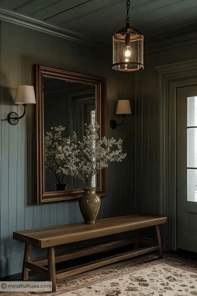
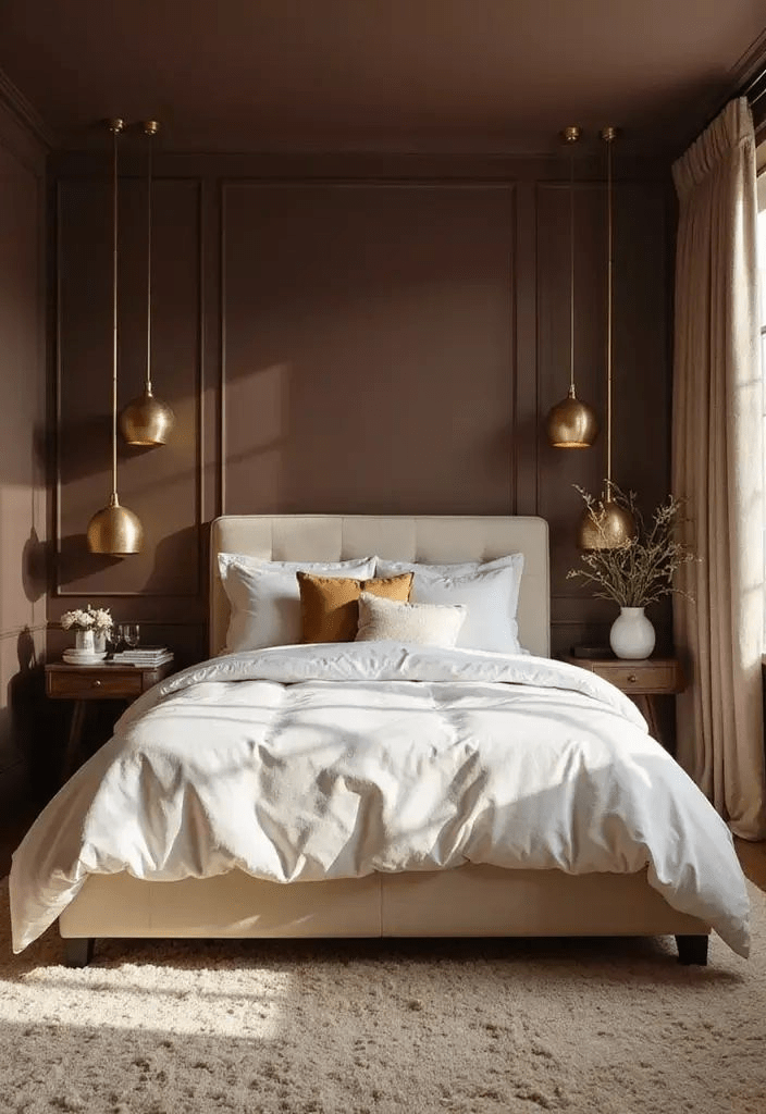
Earthy Neutrals (clay, terracotta, warm sand): The most forgiving entry point. These tones are inherently layered and complex, making it easy to find natural tonal variations within the same family. They work in north and south-facing rooms. They age beautifully with natural light.
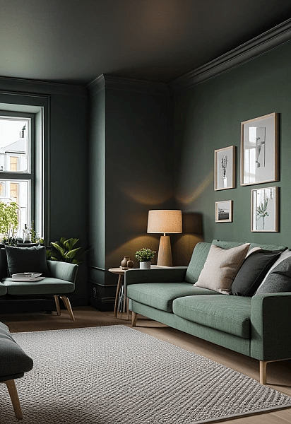
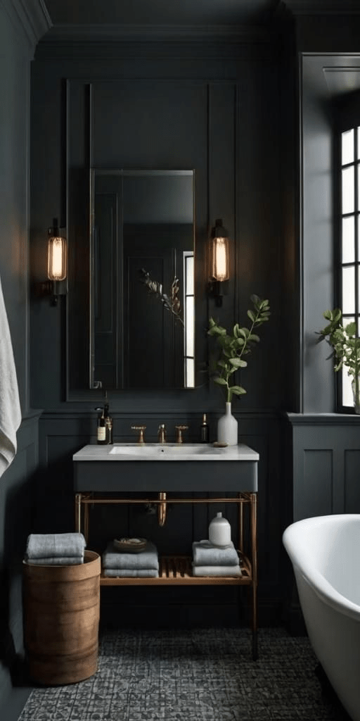
Cool Greens and Sage: My personal favorite for small bathrooms and studies. Cool greens recede optically, creating a sense of depth even in the shallowest rooms. A sage-drenched bathroom with a glossy sage ceiling feels like a wellness spa rather than a cupboard.
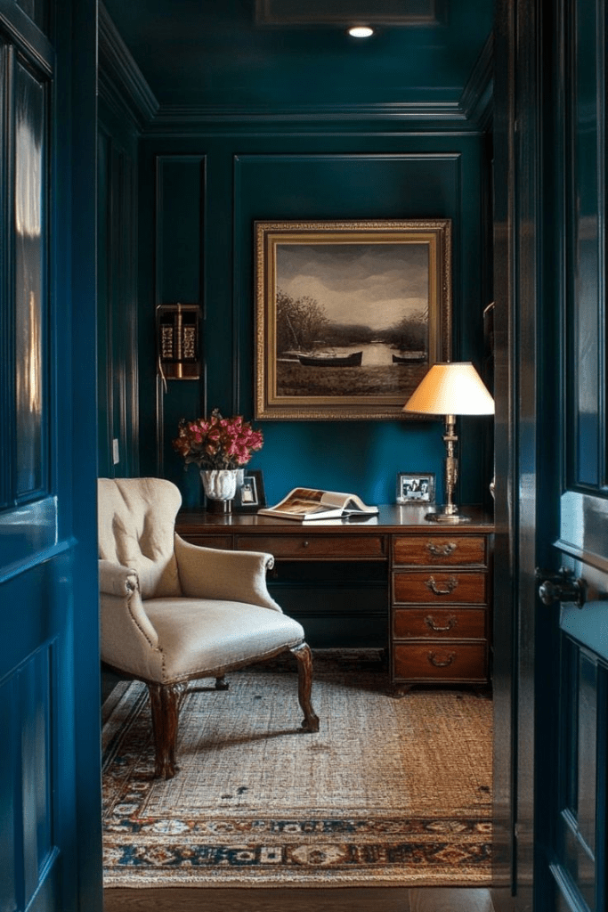
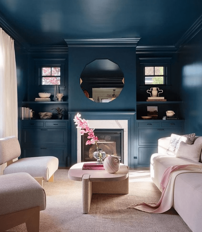
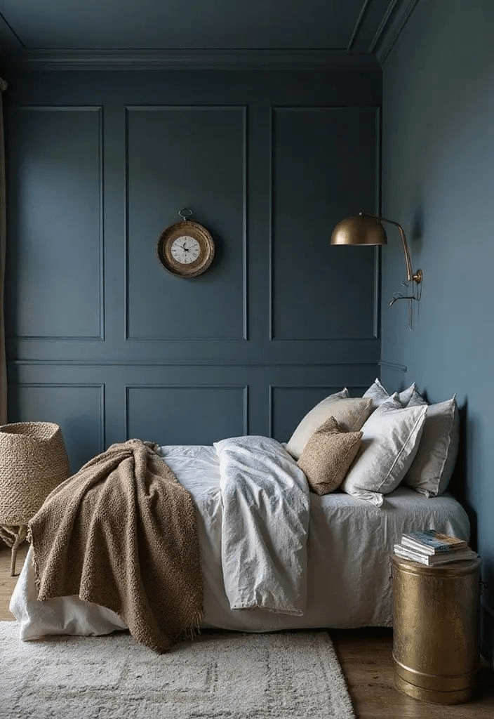
Dusty Blues and Slate: The ultimate space-expanders. Blue recedes. Deep dusty blue walls with a slightly lighter domed ceiling is one of the oldest visual tricks in architecture churches have been using it for centuries to make spaces feel infinite.
Moody Jewel Tones: For the bold. A deep plum or inky teal small room, done with total commitment, is breathtaking. I dedicated an entire piece to this seasonal approach if you’re ready to go deep, my fall color drenching guide on rich jewel tones covers exactly how to pull this off with confidence.
What NOT to Do: Common Mistakes That Undermine the Effect
A few pitfalls I see constantly:
Stopping at the walls. Color drenching requires commitment. If you paint the walls sage and leave the ceiling white and the trim white, you’ve just painted a room. The magic only happens when the envelope is complete.
Choosing a color that’s too saturated. Bright, highly saturated colors (think electric blue or fire engine red) are difficult to drench because the eye tires of them. Muted, complex tones ones with grey or brown undertones have the depth to sustain an entire room.
Ignoring the floor. You can’t control every floor, but where you can a painted floor, a large area rug bringing the floor into the tonal family deepens the immersion dramatically.
Forgetting about light sources. A north-facing small room drenched in cool grey-blue will feel like a cave without careful attention to warm artificial lighting. Layer your light sources: overhead, floor lamp, table lamp. Warm bulb temperatures (2700K–3000K) transform a cool drench into something magical at night.
Real-Room Applications: Where to Start
The Small Living Room: Start with walls and ceiling. Paint the ceiling one shade lighter than your walls. Paint all trim and the fireplace surround (if you have one) one shade deeper. Introduce your tonal range through a large area rug, cushions, and one or two statement upholstered pieces.
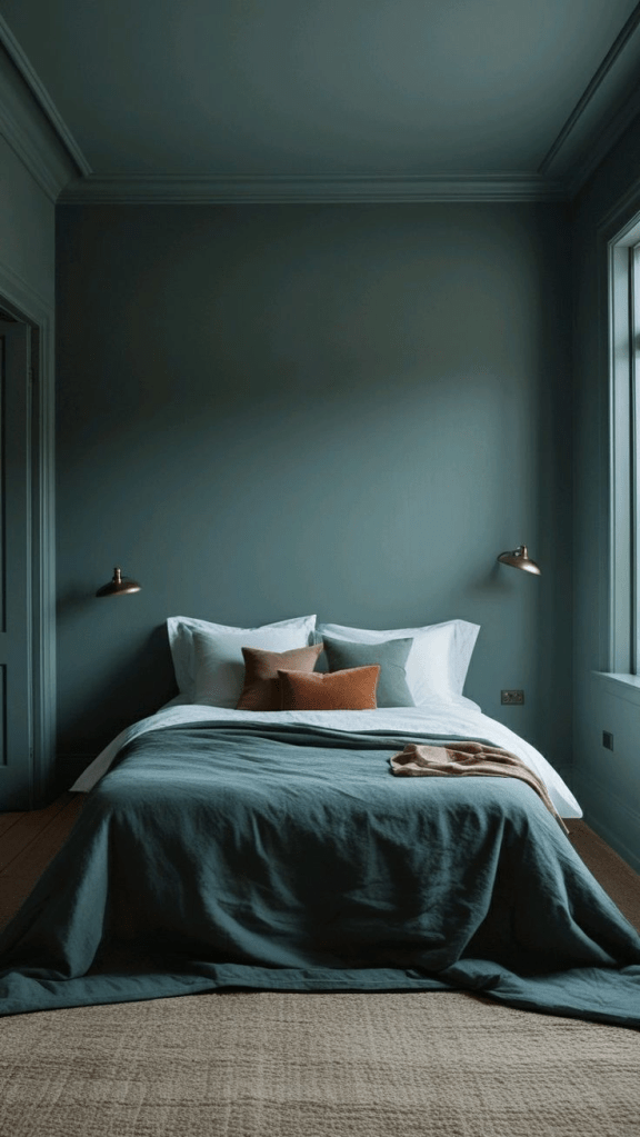
The Tiny Bedroom: This is color drenching’s natural home. Bedrooms should feel enveloping. A deeply tonal bedroom soft terracotta walls, warm linen bedding, clay-colored curtains pooling on the floor is genuinely one of the most restorative environments you can create for yourself.
The Compact Bathroom: Go full gloss on the ceiling. In a small bathroom with a glossy ceiling in your accent color, the reflected light creates an almost jewel-box effect. Pair with matching painted vanity, coordinating towels, and matching grout if you’re retiling.
The Awkward Hallway: Hallways are ideal drench candidates because their primary function is movement, not living. A deeply drenched hallway dark, moody, immersive creates a sense of drama and anticipation that elevates every room it connects to.
Final Thoughts: Small Is Not a Problem to Solve
Here’s what I want you to take away.
Your small room is not a failure of floor plan. It’s not something to apologize for or work around. With monochrome depth and a genuine color drench, it becomes something far more interesting than a large, neutrally painted room: it becomes a place. Specific. Memorable. Yours.
The tools are simple. The commitment is the hard part letting go of the white-wall safety blanket and trusting that color, handled with intelligence and layering, will do more for your small space than any amount of clever furniture arrangement.
Start with one room. Test your tones. Paint the ceiling. Don’t stop at the walls.
And when you do? I’d love to see it. Share your color drenching journey with me because every transformed small space is proof that the best design advice is always the one that contradicts what you thought you knew.
Explore more on Linda Designs:
- The Complete Color Drenching Room-by-Room Guide
- Choosing the Best Paint Colors for Your Home
- Fall Color Drenching: Jewel Tones That Transform Spaces
External References:
- Architectural Digest — Color Drenching Trend
- Farrow & Ball — Paint Finish Guide
- Apartment Therapy — Small Space Design
