As a passionate design enthusiast and a dedicated blogger, I’ve had the distinct privilege of
observing the ever-shifting tides of interior design. Trends, much like seasons, come and go,
each leaving its unique imprint on our living spaces. Yet, few have exerted such a pervasive,
almost monolithic, influence as the cool gray phenomenon that dominated homes for the
better part of the last decade.
It was ubiquitous, a seemingly safe and sophisticated choice that permeated everything from wall paints to furniture upholstery.
However, as we navigate the vibrant landscape of mid-2025, a profound transformation is
sweeping through the world of home aesthetics.
The reign of sterile, often chilly, grays is definitively drawing to a close, a shift noted by leading voices in the design world [2].
A new, more inviting paradigm is emerging: the warmth revolution in home decor. This isn’t merely a fleeting trend; it’s a heartfelt embrace of comfort, an ardent pursuit of inviting aesthetics, and a conscious decision to cultivate spaces that genuinely nurture our souls. It’s time to explore how to infuse your home with these rich, comforting tones and, in doing so, gracefully usher out the era of cool, impersonal interiors.
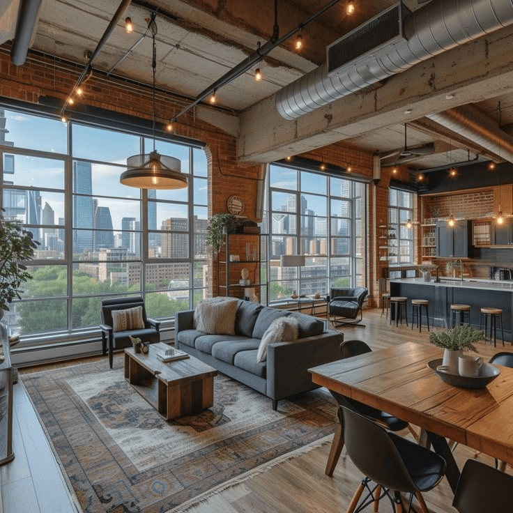
This comprehensive guide will illuminate the path to a more vibrant, psychologically enriching living environment, offering practical insights and inspiring ideas for every design enthusiast looking to create a truly cozy home aesthetic. For those interested in specific design elements that can transform even challenging spaces, consider exploring our insights on urban loft design.
The Fading Echo of Gray: A Shift in Our Relationship with Home
The cool gray trend, which cast its pervasive shadow across the 2010s, certainly served a
purpose. In an era marked by economic uncertainty and a collective yearning for stability,
gray offered a visual balm a neutral, seemingly safe haven from the tumultuous outside
world.
Homeowners, seeking solace and simplicity, gravitated towards its understated elegance, believing it to be a timeless choice that would resist the fickle whims of fashion.
Yet, as the world has evolved, so too has our fundamental relationship with our personal
sanctuaries.
The unprecedented shift towards remote work, the enduring global challenges,
and a burgeoning, almost primal, desire for genuine comfort have irrevocably altered our
domestic aspirations.
We no longer merely seek aesthetically pleasing spaces; we crave environments that envelop us in a profound sense of warmth, security, and belonging.
The sterile, gallery-like interiors that once felt chic now often feel cold, even alienating.
I’ve personally observed this dramatic metamorphosis in countless conversations with fellow design enthusiasts and through the vibrant discussions within my online communities.
Where once the prevailing request was for “something neutral that won’t date,” the heartfelt plea now resonates with a desire for “spaces that feel like a warm hug.” This isn’t merely a superficial aesthetic preference; it delves deep into the realm of color psychology in home decor.
The profound impact of our surroundings on our emotional well-being is undeniable. Indeed, the burgeoning interest in psychological benefits of warm colors home is a testament to this evolving understanding, as these inviting hues have been scientifically shown to reduce stress, foster relaxation, and cultivate an atmosphere of profound tranquility.
The Irresistible Allure of Warm Tones: A Symphony for the Senses
To truly grasp the significance of this shift, one must delve into the fascinating realm of color psychology, a critical component when interpreting and applying 2025 color trends warm.
Warm colors those imbued with the fiery passion of red, the vibrant energy of orange, and the radiant optimism of yellow possess an inherent ability to evoke feelings of comfort, vitality, and joy.
In stark contrast to the often distant and impersonal aura of cool grays, warm tones immediately forge a sense of intimacy and welcome, transforming a mere house into a cherished home. It’s a visceral experience, a subtle yet powerful embrace that resonates deeply within our subconscious.
Empirical research in environmental psychology consistently demonstrates that rooms
adorned with warm tones actively encourage social interaction and cultivate an
unparalleled sense of coziness that cool palettes simply cannot replicate [1].
When my readers and fellow bloggers lament that their gray-dominated rooms feel “cold” or
“uninviting,” it’s not merely a matter of subjective taste; it’s a natural, almost instinctual, human response to the subtle yet pervasive chill of cool undertones.
This understanding forms the bedrock of the cozy home aesthetic movement, which
champions the creation of spaces that are not only visually appealing but also deeply
comforting and emotionally resonant.
By consciously choosing warm colors, we are, in essence, curating environments that actively promote mental well-being and foster a profound sense of peace within our daily lives.
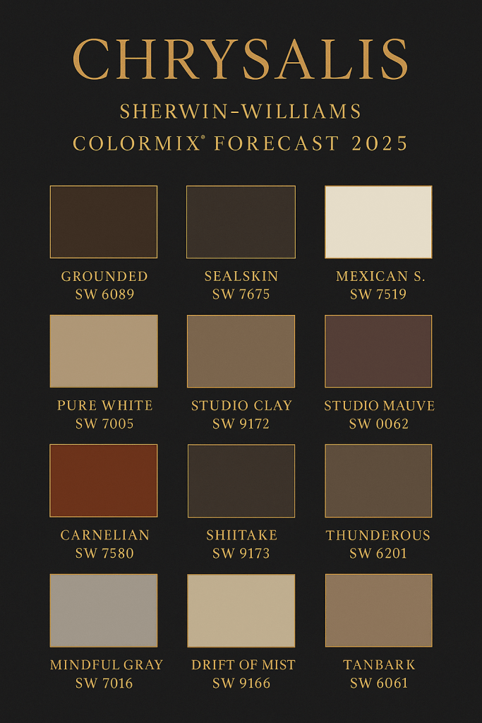
Curating Your Warm Palette: Beyond the Beige and Into the Bold
The transition from cool grays to a warmer aesthetic doesn’t imply a return to monotonous
beige. On the contrary, the spectrum of warm home decor color trends for 2025 is rich,
nuanced, and incredibly diverse, offering a plethora of options to suit every taste and design
sensibility.
As a design enthusiast, I’ve spent countless hours exploring these emerging
palettes, and I’m thrilled to share some of my absolute favorites, each capable of
transforming your living space into a haven of comfort and style.
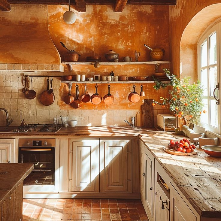
Earthy Terracottas: Grounding Your Space with Natural Vibrancy
Without a doubt, the undisputed star of the warm home decor movement in 2025 is
terracotta. This profoundly rich, earthy tone, with its deep reddish-brown undertones,
effortlessly brings the grounding energy of natural clay and sun-baked earth directly into
your living environment.
It’s a color that speaks of authenticity, craftsmanship, and a connection to the organic world. From my perspective as a blogger who constantly seeks to inspire, I wholeheartedly recommend embracing terracotta as a strategic accent. Imagine an accent wall behind a plush sofa, creating an immediate focal point that exudes warmth and character.
Alternatively, consider a terracotta-hued throw, a collection of artisanal pottery, or even a statement rug to introduce this grounding element.
When paired with creamy whites, soft off-whites, and the inherent beauty of natural wood tones, terracotta truly sings,creating a harmonious and deeply inviting atmosphere that feels both ancient and utterly contemporary.
Creamy Mushroom Tones: The Sophisticated Bridge to Warmth
For those who might feel a touch apprehensive about a dramatic departure from neutrality,
the good news is that saying goodbye to gray doesn’t necessitate abandoning
sophisticated neutrals altogether.
Enter the exquisite world of mushroom tones. These are not your grandmother’s drab beiges; rather, they are warm, complex, beige-based colors subtly infused with just a whisper of gray undertone. This delicate balance allows them to offer the refined sophistication often associated with gray, while simultaneously delivering the much-coveted warmth your space yearns for.
They are the perfect transitional hue,providing a soft, enveloping backdrop that allows other warm elements to truly shine. Think of them as the quiet heroes of your new warm palette, providing a versatile foundation for layering textures and colors.
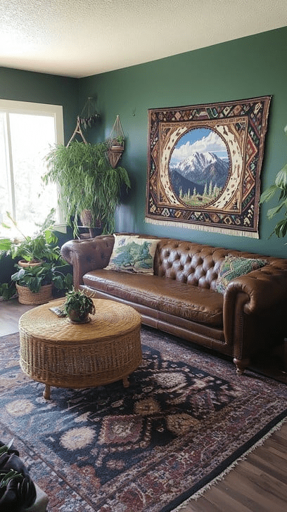
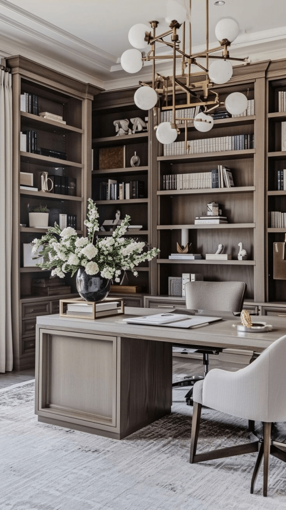
Rich Caramel and Cognac: Indulgent Hues for Elevated Spaces
Prepare to witness the triumphant return of deep, luxurious browns. Shades like rich
caramel and opulent cognac are making a significant comeback, and for good reason. These
sophisticated hues possess an inherent depth and richness that can instantly elevate any room, imbuing it with a sense of refined elegance and cozy grandeur.
From my observations, they work particularly beautifully in more intimate settings such as dining rooms, where they can foster an atmosphere of convivial warmth, or in home offices, where they create spaces that feel both professional and profoundly inviting.
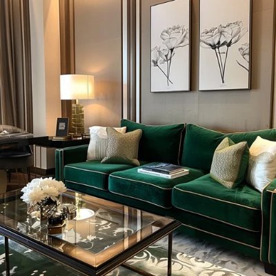
The magic truly happens when these colors are paired with the gleaming allure of brass hardware, the tactile comfort of natural textures like leather and wool, and perhaps a touch of deep, jewel-toned green. The result is an environment that feels both grounded and utterly luxurious, a testament to thoughtful design.
Soft Sage and Olive: Nature’s Embrace with a Warm Undertone
For those drawn to the tranquility of green, the current trend leans towards tones with
distinct warm undertones, such as soft sage and deep olive. Unlike the often-chilly mint
greens that once graced contemporary spaces, these warmer greens feel inherently
grounding, organic, and deeply serene.
They evoke the lushness of a forest floor or the gentle calm of a sun-drenched meadow, bringing a sense of the outdoors in. These hues are perfect for creating spaces that promote relaxation and mindfulness, acting as a soothing counterpoint to more vibrant warm colors or standing alone as a testament to understated natural beauty.
They pair exquisitely with natural wood, creamy textiles, and subtle metallic accents, creating an oasis of calm within your home. If you’re looking for more seasonal inspiration, delve into our top 10 autumn decor ideas to truly transform your home for the fall.
Your Home’s Warm Room-by-Room Transformation: Infusing Warmth into Every Corner
Embarking on a warm home decor transformation can feel like a monumental task, but by
approaching it room by room, you can create a cohesive and inviting aesthetic throughout
your entire living space.
As a design enthusiast, I believe every room holds the potential to become a sanctuary of warmth and comfort. Let’s explore how to achieve this, with practical tips and insights gleaned from years of observing and participating in the design world.
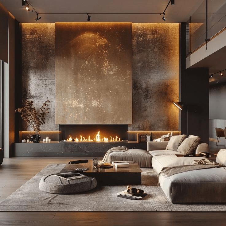
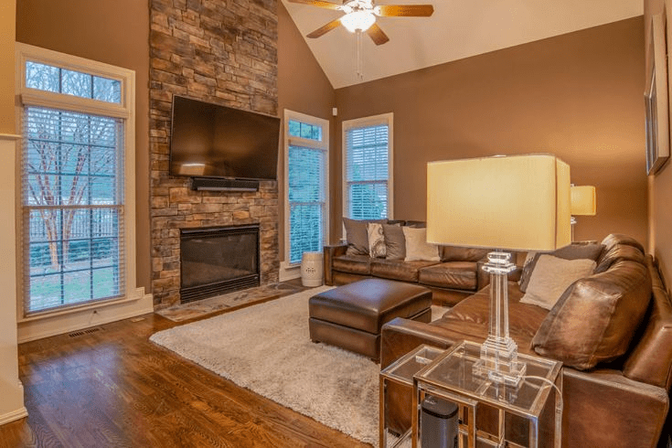
Living Rooms: The Beating Heart of Warmth
Your living room, often the central gathering space in your home, is the ideal starting point
for this warmth revolution. Begin by re-evaluating your walls. If they currently sport cool
gray tones, consider a repaint with a warm mushroom or a soft terracotta. This immediate
shift in backdrop can dramatically alter the room’s entire ambiance.
However, if a full repaint isn’t feasible or desired, fear not! You can still achieve significant impact through strategic layering. Introduce an abundance of warm-toned throw pillows in varying textures
think chunky knits, soft velvets, and woven linens.
Drape cozy blankets over sofas and armchairs. Curate artwork that features warm color palettes, perhaps landscapes with autumnal hues or abstract pieces with rich, earthy tones. The fundamental principle here is to layer different warm tones and textures, creating a visual and tactile depth that invites relaxation and conversation. This approach to living room warm decor ensures a
welcoming atmosphere.
Pro tip from my extensive design research and personal experimentation: Always, and I
mean always, test paint colors in different lighting conditions throughout the day. A warm
color can appear surprisingly different under morning sunlight, afternoon indirect light, and
evening artificial illumination.
Live with large paint samples on your walls for at least a week before making a final commitment. This seemingly small step can save you from significant disappointment and ensure your chosen hue truly delivers the desired warmth.
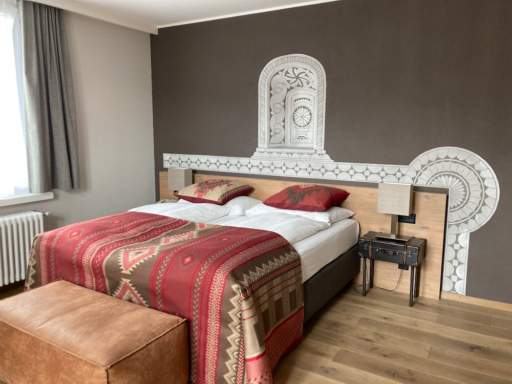
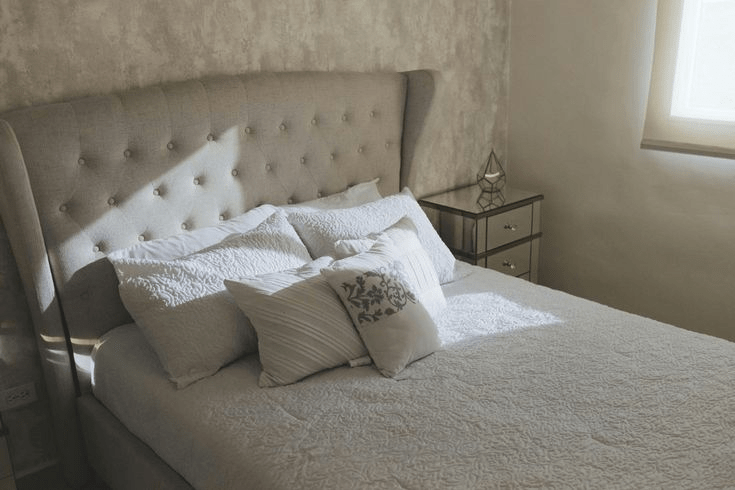
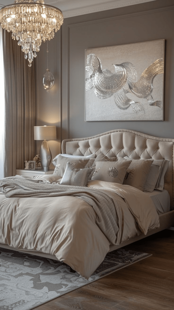
Bedrooms: Crafting Cozy Sanctuaries for Rest and Rejuvenation
Bedrooms, by their very nature, are meant to be havens of peace and tranquility. They
benefit immeasurably from the enveloping embrace of warm color schemes. Imagine a soft
caramel accent wall behind your headboard, creating an immediate sense of intimacy and
luxury.
Pair this with crisp, creamy white bedding, perhaps with subtle textured details, and
warm wood furniture a sturdy dresser, a classic nightstand. This thoughtful combination
creates the perfect environment for deep rest, peaceful contemplation, and genuine
rejuvenation.
The goal for bedroom warm decor is to create a cocoon-like effect, a space where you can truly unwind and escape the stresses of the day. Consider adding warmtoned lighting, such as bedside lamps with fabric shades, to further enhance the cozy ambiance.
Kitchens: Beyond the Monochromatic and Into the Inviting
While the allure of pristine white kitchens has endured for years, and gray kitchens have
certainly had their moment, there’s a growing desire to infuse these functional spaces
with more warmth and personality.
Adding warm undertones can utterly transform a kitchen, making it feel more inviting and less utilitarian. Consider warm white cabinets, which offer a subtle creaminess rather than a stark, cool white. Pair these with elegant brass hardware cabinet pulls, faucets to introduce a touch of metallic warmth.
For a bolder statement, explore a terracotta tile backsplash, which can add a rustic, earthy charm.
Alternatively, opt for warm wood countertops or a butcher block island to instantly infuse
the space with natural texture and a welcoming glow.
These elements contribute significantly to a kitchen warm aesthetic, making it a more enjoyable place to cook, gather, and create memories.
Practical Implementation Strategies: Making Warmth a Reality
Transforming your home with warm colors doesn’t require a complete overhaul or an
unlimited budget. It’s about making informed choices and understanding how different
elements work together to create a cohesive and inviting atmosphere. Here are some
practical strategies that I, as a design enthusiast, have found to be incredibly effective.
The 60-30-10 Rule: A Harmonious Color Formula
When implementing 2025 color trends in your home, the classic 60-30-10 rule is an
invaluable tool for achieving balance and visual harmony.
This principle suggests that 60% of your room should be a dominant color, 30% a secondary color, and 10% an accent color.
For a warm palette, this might translate to:
- 60% a dominant warm neutral like a mushroom tone, providing a calming and expansive backdrop;
- 30% a secondary warm color such as a rich terracotta or a deep sage, adding depth and character; and
- 10% an accent color, perhaps a gleaming brass, a vibrant jewel-toned green, or a deep cognac, providing pops of visual interest and personality. This ensures that your space feels thoughtfully designed and avoids an overwhelming monochromatic effect, even within a warm palette.
Lighting Considerations: Illuminating the Warmth
Warm colors, while inherently inviting, truly come alive with thoughtful lighting. The type of
light bulb you choose can significantly impact how your warm hues are perceived. I strongly
recommend opting for LED bulbs with a warm color temperature, typically ranging from
2700K to 3000K (Kelvin) [3].
These bulbs emit a soft, yellowish light that enhances the cozyfeeling of warm colors, making them appear richer and more vibrant. In contrast, cool lighting (higher Kelvin temperatures) can make warm colors appear dull, muddy, or even sickly. Furthermore, installing dimmer switches in key areas living rooms, dining rooms, bedrooms is a game-changer.
Dimmers allow you to control the ambiance throughout the day, from bright and energetic to soft and intimate, perfectly complementing your warm decor choices. This focus on warm lighting for home interiors is paramount.
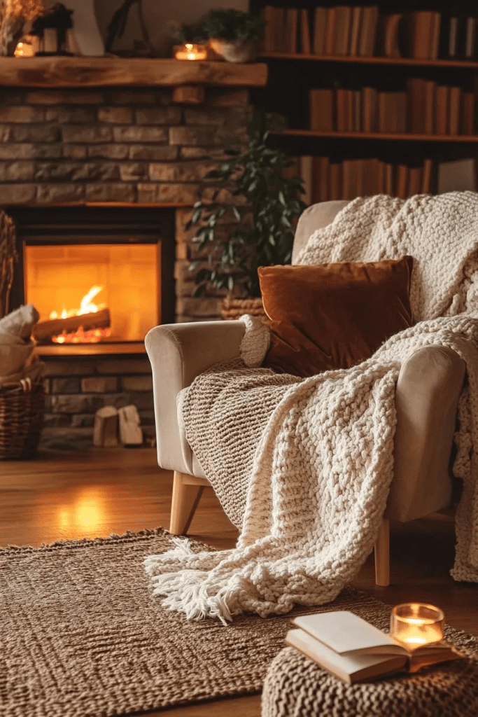
Texture and Material Pairing: A Tactile Embrace
To truly amplify the impact of your warm color palette, consider the power of texture and
material pairing. Warm colors resonate beautifully with natural materials, creating a sensory
experience that is both visually appealing and tactilely comforting.
Think about incorporating jute rugs, which add an organic, earthy feel and a wonderful textural contrast [4]. Linen curtains, with their relaxed drape and subtle variations, soften natural light and
enhance the cozy atmosphere. Wooden furniture, whether reclaimed pieces or
contemporary designs, brings an inherent warmth and grounding presence.
Finally, brass accents in lighting fixtures, decorative objects, or hardware provide a touch of
sophisticated gleam that complements warm tones exquisitely. These elements collectively
reinforce the organic, inviting feeling that warm colors naturally evoke, contributing to a
truly cozy home aesthetic.
Budget-Friendly Warm Transformations: Achieving Impact Without Breaking the Bank
One of the most common misconceptions about transforming a home’s aesthetic is that it
requires a substantial financial investment. As a blogger dedicated to making design
accessible, I’m here to tell you that embracing warm home decor can be incredibly
budget-friendly.
Significant impact can be achieved through thoughtful, incremental changes, proving that style doesn’t have to come with a hefty price tag. It’s about smart choices and creative applications.
Small Changes, Monumental Impact
- Warm-toned throw pillows and blankets: These are perhaps the easiest and most
effective way to introduce color and texture. Opt for shades of terracotta, mustard, deep
olive, or rich caramel in varying fabrics like velvet, chunky knits, or linen. They instantly
add layers of comfort and visual interest. - Brass or warm metal picture frames: Swap out cool silver or black frames for those in
brass, copper, or antique gold. This subtle change can warm up an entire gallery wall or
a single cherished photograph. - Wooden decorative objects: Incorporate bowls, sculptures, or even simple wooden
trays. The natural grain and warmth of wood instantly ground a space and complement
warm color palettes beautifully. - Warm-toned artwork: Seek out prints, paintings, or even textiles that feature rich,
inviting colors. This can be a landscape with a golden hour glow, an abstract piece with
earthy reds and oranges, or a vintage botanical print. - Natural fiber rugs: Jute, sisal, or wool rugs in natural, undyed tones add incredible
texture and warmth underfoot, instantly making a room feel cozier and more inviting.
They are also excellent for layering over existing carpets or hard floors.
DIY Paint Projects: A Stroke of Genius for a Warm Embrace
Perhaps the most cost-effective and transformative way to say goodbye to gray and fully
embrace the warmth revolution is through a strategic DIY paint project. A single accent wall,
painted in a rich terracotta, a calming sage, or a sophisticated mushroom tone, can
dramatically alter the perception and ambiance of an entire room.
It’s a powerful visual statement that requires minimal investment but yields maximum impact. This approach allows you to experiment with bolder hues without committing to an entire room, making
the transition both manageable and exciting.
Remember, paint is relatively inexpensive, and the impact it has on a space is truly unparalleled. For a more comprehensive guide on selecting the perfect hues, be sure to read our ultimate guide to choosing the best paint colors for your home.
The Profound Psychology of Warmth: More Than Just a Pretty Color
After years of meticulously researching and extensively writing about design trends, I’ve
consistently observed a fascinating phenomenon: homeowners universally report feeling
more relaxed, more content, and genuinely happier in warm-toned rooms.
This isn’t a mere coincidence or a subjective preference; it’s deeply rooted in the psychological
benefits of warm colors home. Warm colors possess an inherent ability to trigger positive
emotional responses, creating environments that feel inherently more inviting, secure, and
nurturing for both residents and their cherished guests. They evoke feelings of comfort,
safety, and connection, fostering a sense of well-being that cool, stark interiors often fail to
provide.
The widespread movement away from cool grays signifies far more than a fleeting design
trend; it represents a profound cultural shift. It’s a collective re-prioritization of comfort,
emotional well-being, and genuine human connection within our most intimate spaces.
As our lives increasingly unfold within the confines of our homes whether for work,
relaxation, or family gatherings the imperative to cultivate environments that actively
nurture our mental health becomes not just desirable, but absolutely essential. This is the
true essence of the warmth revolution: designing spaces that don’t just look good, but feel
good, too.
Professional Designer Insights: Navigating the Warmth Revolution with Finesse
Even for the most enthusiastic DIY designers, there are nuances to mastering the art of
warm decor. Drawing from my observations of leading designers and my own explorations,
here are some crucial tips to ensure your warm transformation is a resounding success.
Avoiding Common Warm Color Missteps
- Don’t go too bold too quickly: While the allure of vibrant warm hues is strong, it’s
often wise to begin your journey with warm neutrals. Gradually introduce stronger,
more saturated warm tones through accents, textiles, and smaller furniture pieces. This
allows you to build confidence and ensures a cohesive, rather than overwhelming,
result. - Consider your home’s natural light: The direction your windows face profoundly
impacts how colors appear. North-facing rooms, which receive cooler, indirect light,
benefit immensely from warmer colors, as these hues can counteract the inherent
coolness. Conversely, south-facing rooms, bathed in abundant warm light, can handle
cooler warm tones or even benefit from a touch more saturation without becoming
overpowering. - Layer your warm tones: The secret to a rich, sophisticated warm palette lies in
layering. Don’t stick to a single shade of terracotta or mushroom. Instead, use different
values (lightness/darkness) and intensities (saturation) of warm colors. Combine a pale
peach with a deep rust, or a soft beige with a rich caramel. This creates depth,
dimension, and a sense of effortless elegance that is the hallmark of truly well-designed
spaces.
When to Seek Professional Guidance
While many aspects of the warmth revolution are wonderfully DIY-friendly, there are specific
scenarios where the expertise of a professional interior designer can be invaluable. Consider
seeking professional help when:
- Planning whole-home color schemes: A designer can create a cohesive flow of warm
colors throughout your entire home, ensuring each room transitions seamlessly and
feels harmonious. - Working with challenging lighting conditions: If your home has unusual light sources
or limited natural light, a designer can expertly navigate these complexities to select
colors that perform optimally. - Coordinating with existing architectural features: Older homes with unique
architectural details, or spaces with fixed elements like built-in cabinetry or specific
flooring, often require a designer’s eye to integrate new warm palettes seamlessly. - Selecting high-investment items: When choosing costly elements like cabinetry,
flooring, or large upholstered pieces, a designer’s guidance can prevent expensive
mistakes and ensure long-term satisfaction with your warm decor choices.
Looking Forward: The Enduring Embrace of Warm Design
The warmth revolution, as I perceive it from my vantage point as a design enthusiast and
blogger, extends far beyond a mere shift in color preference; it embodies a fundamental
reorientation in how we conceptualize and interact with our homes.
It is, at its core, about prioritizing human comfort, fostering emotional well-being, and cultivating spaces that resonate with our deepest needs for security and belonging. As we progress through the latter half of 2025 and beyond, anticipate witnessing this profound trend evolve and
permeate every facet of home design.
This evolution will transcend simple paint colors, influencing furniture design, the strategic placement and type of lighting, and even the foundational principles of architectural planning. The future of cozy home aesthetic is not just about visual appeal; it’s about creating a holistic sensory experience.
The era of sterile, almost museum-like homes, characterized by their stark neutrality and
lack of personal expression, is unequivocally behind us. The future, a future I am incredibly
excited to explore and share with my readers, belongs to spaces that feel genuinely lived-in, deeply loved, and inherently human.
These are the homes that tell stories, that bear the gentle marks of daily life, and that invite genuine connection. By consciously embracing warm colors and, with a sense of liberation, saying goodbye to cool grays, we are not simply adhering to a passing trend. Instead, we are actively participating in a movement that champions the creation of homes designed to truly nurture our souls, providing a constant source of comfort, inspiration, and peace in an ever-complex world.
Conclusion: The Heart of a Home Transformed
The warmth revolution represents more than a superficial aesthetic adjustment; it signifies
a profound, almost philosophical, shift in our collective approach to living spaces.
Through my continuous research, extensive writing, and passionate engagement with design trends,
I can assert with unwavering confidence that warm colors possess an unparalleled capacity
to create environments that are not only breathtakingly beautiful but also profoundly
psychologically beneficial.
They are the silent architects of our emotional landscapes, subtly influencing our moods and fostering a sense of calm and contentment.
Whether your journey into this inviting new aesthetic begins with the subtle introduction of
a single accent wall in a rich, earthy tone, or you feel inspired to embark on a
comprehensive, whole-home transformation, embracing the 2025 color trends and
integrating warm home decor will undoubtedly elevate your space into a true sanctuary.
The era of cold, clinical grays, with its detached formality, has gracefully receded. We stand
now at the threshold of a new age an age defined by warmth, by comfort, and by homes
that genuinely feel like a heartfelt embrace. Welcome to a world where your living space is
not just a structure, but a vibrant, nurturing extension of your very being.
[1] Color Psychology.org. Warm vs Cool Colors – Their Psychological Effects Explained.
Available at: https://www.colorpsychology.org/warm-cool-colors/
[2] Vogue. These Colors Will Be Everywhere in Interiors in 2025. Available at:
https://www.vogue.com/article/interiors-color-trends-2025
[3] Lumens. Kelvin Color Temperature Chart | Lighting Color Scale at Lumens. Available at:
https://www.lumens.com/the-edit/the-guides/understanding-kelvin-color-temperature/
[4] Jaipur Rugs. Are Jute Rugs the Perfect Choice? Pros & Cons of Jute Carpets. Available at:
https://www.jaipurrugs.com/blog/pros-and-cons-of-buying-jute-rugs
Follow us on Pinterest, Suscribe, Like and Share !
