
- I. Introduction: The Transformative Power of Paint
- II. Understanding Color Psychology and Its Impact on Your Home
- III. Best Paint Colors for Every Room: A Deep Dive
- A. Best Paint Color for Bedroom: Creating a Sanctuary
- B. Best Paint Colors for Living Room: The Heart of Your Home
- C. Best Paint Colors for Bathrooms: Freshness and Functionality
- D. Best Paint Color for Kitchen: Culinary Inspiration
- E. Best Paint Color for Home Office: Cultivating Productivity and Focus
- F. Best Paint Colors for Interior Walls: General Principles
- IV. Paint Color Trends 2025: Staying Ahead of the Curve
- V. Choosing the Right Paint: Beyond Color
- VI. Where to Buy Your Perfect Paint: Trusted Sources
- VII. Tips to Achieve Professional Results
- VIII. Conclusion: Your Home, Your Canvas
- Related Posts
I. Introduction: The Transformative Power of Paint
With experience, I’ve witnessed firsthand the incredible power of paint to transform any space. It’s more than just a coating on your walls; it’s a fundamental element that dictates mood, enhances architectural features, and reflects personal style.
For designers, architects, decor enthusiasts, and homeowners alike, understanding the nuances of paint color is paramount to creating environments that are not only aesthetically pleasing but also deeply resonant.
This comprehensive guide will delve into the world of paint colors, offering insights into the best paint color for home across various rooms, exploring the latest paint color trends 2025, and providing practical advice from a trusted source to help you make informed decisions.
Whether you’re embarking on a full home renovation or simply looking to refresh a single room, this article will equip you with the knowledge and inspiration to choose the perfect palette.
II. Understanding Color Psychology and Its Impact on Your Home
Before diving into specific color recommendations for each room, it’s crucial to grasp the fundamental principles of color psychology. Colors possess an inherent ability to influence our emotions, perceptions, and even our behavior.
Understanding this color psychology home connection is key to selecting hues that not only look good but also feel right for the intended purpose of a space.
For instance, cool colors like blues and greens are often associated with tranquility and calmness, making them ideal for bedrooms and bathrooms.
Conversely, warm colors such as reds, oranges, and yellows tend to evoke feelings of energy, passion, and warmth, making them suitable for social areas like living rooms or dining rooms.
Neutrals grays, beiges, whites offer a versatile backdrop, providing a sense of balance and sophistication while allowingother design elements to shine. When considering choosing paint colors, think about the atmosphere you wish to create. Do you want a vibrant, stimulating environment, or a peaceful, restorative sanctuary?
The answer to this question will guide your color choices and ensure your home truly reflects your desired mood and functionality.
III. Best Paint Colors for Every Room: A Deep Dive
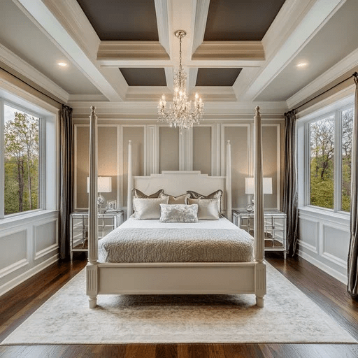
A. Best Paint Color for Bedroom: Creating a Sanctuary
The bedroom is your personal retreat, a sanctuary where you unwind, recharge, and find solace. Therefore, the best paint color for bedroom spaces should promote relaxation and tranquility.
Soft, muted tones are generally preferred, as they create a serene and calming atmosphere conducive to rest. Consider shades of blue, green, and gentle grays. For example, a light dusty blue can evoke the feeling of a clear sky, while a soft sage green connects you with nature, fostering a sense of peace.
Popular Choices for Calming Bedroom Paint Colors:
Soft Blues: Think of colors like Sherwin-Williams’ ‘Quietude’ (SW 6212) or Benjamin Moore’s ‘Palladian Blue’ (HC-144). These hues are known for their soothing qualities, helping to reduce stress and promote restful sleep. They are excellent choices for creating a truly serene bedroom paint ideas environment.
Muted Greens: ‘Sea Salt’ (SW 6204) by Sherwin-Williams or Benjamin Moore’s ‘Healing Aloe’ (1562) are fantastic options. These greens bring an organic, calming feel to the room, perfect for unwinding after a long day.
Warm Grays and Greiges: If you prefer a neutral palette, consider ‘Agreeable Gray’ (SW 7029) from Sherwin-Williams or Benjamin Moore’s ‘Revere Pewter’ (HC-172). These versatile shades provide a sophisticated backdrop that can be easily accessorized with various textures and colors, maintaining a peaceful ambiance.
When selecting your best paint color for bedroom, also consider the amount of natural light the room receives. Lighter shades will make a small bedroom feel more expansive, while deeper, richer tones can create a cozy, intimate haven in larger spaces.
Always test paint samples on your walls to see how the color appears throughout the day under different lighting conditions.

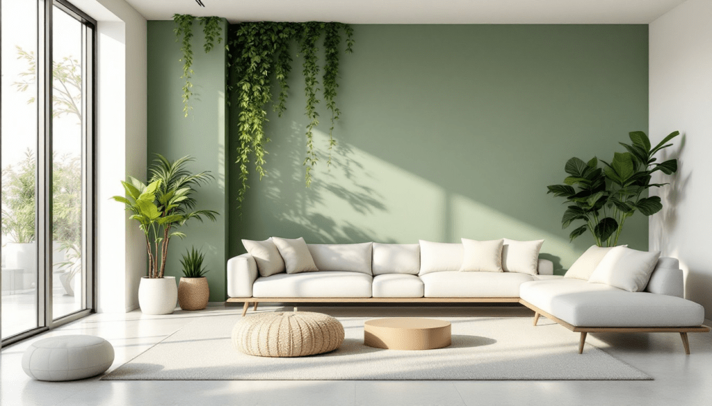
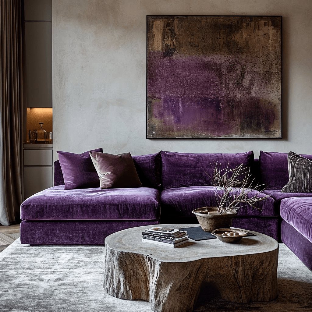
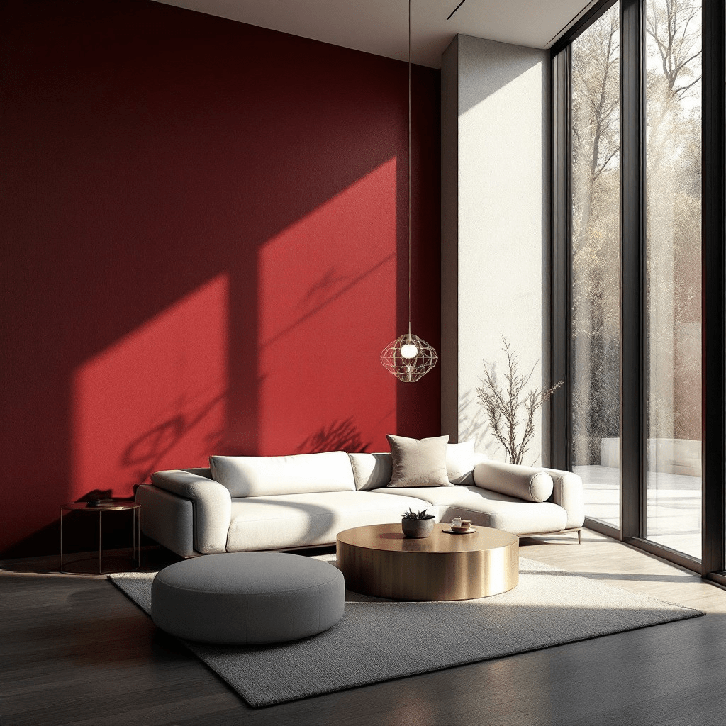
B. Best Paint Colors for Living Room: The Heart of Your Home
The living room is often the central hub of a home, a space for gathering, entertaining, and relaxation. Therefore, the best paint colors for living room spaces should be versatile, inviting, and reflective of your personal style. The goal is to create an atmosphere that is both comfortable for everyday living and impressive for guests.
Versatile Living Room Paint Colors for Every Style:
Warm Neutrals: Shades like Benjamin Moore’s ‘White Dove’ (OC-17) or Sherwin-Williams’ ‘Accessible Beige’ (SW 7036) are incredibly popular for their ability to create a bright, airy, and welcoming feel.
These neutrals serve as an excellent foundation, allowing furniture and decor to stand out. They are perfect for achieving a timeless and elegant look, making them ideal for those seeking versatile living room paint colors.
Soft Grays: A classic choice, grays like Sherwin-Williams’ ‘Repose Gray’ (SW 7015) or Benjamin Moore’s ‘Gray Owl’ (OC-52) offer a sophisticated and contemporary feel. They pair beautifully with both warm and cool accents, making them adaptable to various design aesthetics, from minimalist to industrial. These are excellent modern living room paint ideas.
Earthy Tones: For a cozy and grounded ambiance, consider rich greens like Benjamin Moore’s ‘Hunter Green’ (2041-10) or deep blues such as Sherwin Williams’ ‘Naval’ (SW 6244). These colors add depth and character, creating a more intimate setting, especially in larger living spaces. They can evoke a sense of nature and tranquility, perfect for a relaxed yet refined living area.
Subtle Pastels: Light blues, greens, or even soft pinks can introduce a touch of personality without overwhelming the space. Think of a delicate blush or a pale aqua to add a unique charm and softness to your living room. These shades work well in bohemian or shabby-chic inspired interiors.
When choosing living room paint ideas, consider the natural light the room receives and the existing furniture and decor. A color that looks stunning in a brightly lit showroom might appear different in your home.
Always test samples on different walls to observe how the color changes throughout the day. The right living room paint color can significantly enhance the overall appeal and comfort of your home, making it a truly inviting space for everyone.
C. Best Paint Colors for Bathrooms: Freshness and Functionality
Bathrooms, regardless of their size, are spaces dedicated to cleanliness, rejuvenation, and personal care. The best paint colors for bathrooms should reflect these functions, promoting a sense of freshness, serenity, and often, a feeling of spaciousness.
Given that many bathrooms, especially in older homes, can be on the smaller side, color choice plays a critical role in making the space feel larger and more inviting.
Ideal Paint Colors for Bathrooms and Small Bathrooms:
Crisp Whites: You can never go wrong with a classic white in a bathroom. Shades like Sherwin-Williams’ ‘Pure White’ (SW 7005) or Benjamin Moore’s ‘Chantilly Lace’ (OC-65) create an undeniably clean, bright, and airy feel. They reflect light, making even the smallest bathroom appear more expansive. For a best paint color for small bathroom scenario, white is often the top recommendation, as it maximizes perceived space and brightness.
Soft Grays and Greiges: Light grays, such as Sherwin-Williams’ ‘Light French Gray’ (SW 0055) or Benjamin Moore’s ‘Stonington Gray’ (HC-170), offer a sophisticated alternative to white. They provide a subtle hint of color while maintaining a sense of openness and cleanliness. Greiges, a blend of gray and beige, add a touch of warmth, preventing the space from feeling too sterile.
Cool Blues and Greens: These colors are inherently calming and reminiscent of water and nature, making them perfect for a spa-like bathroom retreat. Consider a soft aqua like Benjamin Moore’s ‘Beach Glass’ (1564) or a pale mint green such as Sherwin-Williams’ ‘Sea Salt’ (SW 6204). These hues contribute to a tranquil atmosphere, ideal for unwinding in a bath or starting your day refreshed. They are excellent bathroom paint ideas for creating a serene escape.
Pale Pastels: For a touch of subtle color and personality, consider very light pastels like a pale lavender or a soft peach. These can add a unique charm without overwhelming the space, especially in a small bathroom. They can create a gentle, inviting glow.
When selecting paint for bathrooms, also consider the finish. A satin or semi-gloss finish is often recommended due to its durability and resistance to moisture, making it easier to clean and preventing mildew growth.
Proper ventilation is also key, but the right paint can certainly aid in maintaining a fresh and functional bathroom. The goal is to create a space that feels clean, bright, and utterly relaxing, whether it’s a grand master bath or a compact powder room.

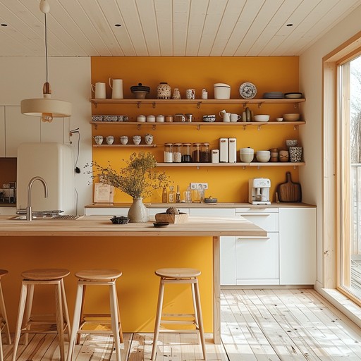
D. Best Paint Color for Kitchen: Culinary Inspiration
The kitchen is often described as the heart of the home, a place where meals are prepared, families gather, and memories are made.
The best paint color for kitchen spaces should reflect this vibrancy and functionality, creating an inviting atmosphere that can also withstand the demands of a busy culinary environment.
When choosing kitchen paint, consider colors that stimulate appetite, evoke a sense of cleanliness, or simply make the space feel warm and welcoming.
Inspiring Kitchen Paint Ideas and Durable Choices:
Warm Neutrals: Creamy whites, soft beiges, and light grays are perennial favorites for kitchens. Colors like Benjamin Moore’s ‘Swiss Coffee’ (OC-45) or Sherwin-Williams’ ‘Alabaster’ (SW 7008) create a bright, clean, and timeless backdrop that allows cabinetry, countertops, and appliances to shine. These shades are incredibly versatile and can be easily updated with accessories, making them excellent kitchen paint ideas for a classic look.
Earthy Greens and Blues: For a more contemporary or farmhouse-inspired kitchen, consider muted greens like Sherwin-Williams’ ‘Evergreen Fog’ (SW 9130) or soft blues such as Benjamin Moore’s ‘Hale Navy’ (HC-154) for an accent wall or island. These colors bring a sense of calm and connection to nature, creating a refreshing and inviting space. They can also add a pop of color without overwhelming the room.
Vibrant Accents: If you prefer a more energetic kitchen, consider using bolder colors on an accent wall or for specific features. A sunny yellow can bring warmth and cheer, while a deep red can stimulate conversation and appetite. These are best used sparingly to avoid overwhelming the space.
Beyond aesthetics, durability is a crucial factor when selecting paint for your kitchen. Kitchens are prone to spills, splatters, and general wear and tear. Therefore, choosing a durable kitchen paint is essential.
Paints with a satin, semi-gloss, or even high-gloss finish are recommended as they are more resistant to moisture, easier to clean, and can withstand frequent wiping without losing their luster.
These finishes also provide a protective barrier against grease and grime, ensuring your kitchen walls remain fresh and vibrant for years to come. Always opt for high-quality, washable paints specifically designed for high-traffic areas to ensure longevity and ease of maintenance.
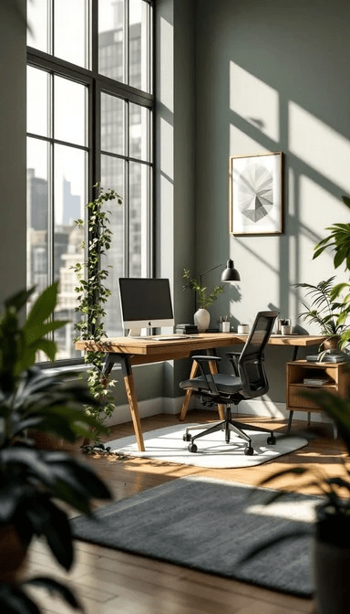
E. Best Paint Color for Home Office: Cultivating Productivity and Focus
In an increasingly remote world, the home office has become a critical space, serving as a hub for productivity, creativity, and focused work. The best paint color for home office environments can significantly impact your concentration, mood, and overall efficiency. Beyond mere aesthetics, the right hue can foster an atmosphere conducive to deep work and innovative thinking.
Colors for Enhanced Productivity and Focus:
Calm Blues and Greens: These colors are renowned for their ability to promote tranquility and mental clarity, making them ideal for a productive workspace. A soft blue, like Benjamin Moore’s ‘Quiet Moments’ (1563), can reduce eye strain and encourage a steady workflow.
Similarly, a muted green, such as Sherwin-Williams’ ‘Evergreen Fog’ (SW 9130), connects us to nature, fostering a sense of calm and reducing stress. These are excellent choices for productive home office paint colors.
Sophisticated Neutrals: While often seen as safe, neutrals can be incredibly powerful in a home office. A warm gray or a soft beige provides a clean, uncluttered backdrop that minimizes distractions. Consider Sherwin-Williams’ ‘Agreeable Gray’ (SW 7029) or Benjamin Moore’s ‘Classic Gray’ (OC-23).
These shades allow your mind to focus on tasks without visual interference, creating a serene yet stimulating environment. They also offer flexibility for incorporating pops of color through accessories.
Deep, Rich Tones (for specific areas): For those who thrive in more dramatic settings, or for an accent wall, deep jewel tones like a rich teal or a deep plum can inspire creativity and a sense of luxury.
These colors can be particularly effective in larger offices or in specific zones within an open-plan space, creating a distinct area for focused work.
However, use them judiciously to avoid overwhelming the space. A deep blue like Benjamin Moore’s ‘Hale Navy’ (HC-154) can evoke a sense of authority and seriousness, perfect for a professional setting.
The ‘Extra Touch’: Biophilic Design and Intentional Color Placement
To truly elevate your home office, consider integrating principles of biophilic design. This involves bringing elements of nature indoors to enhance well-being and productivity.
Beyond just adding plants, select paint colors that mimic natural landscapes. Think of the deep greens of a forest, the serene blues of the sky, or the earthy tones of soil. This approach creates a subconscious connection to the natural world, which has been shown to improve cognitive function and reduce stress.
For instance, pairing a soft green wall with natural wood furniture and a view of greenery outside can significantly enhance focus and creativity.
Furthermore, consider intentional color placement. Instead of painting all four walls the same color, perhaps paint the wall behind your desk a slightly deeper shade to create a focal point and subtly draw your attention to your work area.
Or, use a lighter, more expansive color on the walls facing windows to maximize natural light and create a sense of openness. The goal is to create a space that not only looks good but actively supports your work habits and mental well-being, making it a truly focus enhancing home office paint ideas space.
F. Best Paint Colors for Interior Walls: General Principles
While we’ve explored specific recommendations for individual rooms, there are overarching principles that apply when selecting the best paint colors for interior walls throughout your entire home. The goal is to create a cohesive flow, a harmonious palette that transitions seamlessly from one space to another, reflecting your personal style and enhancing the overall architectural integrity of your home.
The Art of Flow and Cohesion:
Consider Your Home’s Fixed Elements: Before you even pick up a paint swatch, take stock of your home’s existing fixed elements. This includes flooring, cabinetry, countertops, and trim. These elements have undertones (warm, cool, or neutral) that should ideally harmonize with your chosen paint colors.
For instance, if your kitchen cabinets have a warm, creamy undertone, a cool gray paint might clash. Understanding these underlying tones is crucial for a successful interior wall paint guide.
Natural Light is Your Best Friend (and Foe): The amount and direction of natural light a room receives will dramatically alter how a paint color appears. North-facing rooms tend to have cooler, bluer light, making colors appear more muted. South-facing rooms receive warmer, brighter light, which can intensify colors.
East-facing rooms get warm morning light, while west-facing rooms are bathed in warm afternoon light. Always test paint samples on multiple walls and observe them throughout the day to see how the light plays with the color. This dynamic interaction is a key aspect of choosing interior paint.
The Power of the Neutral Palette: For a timeless and versatile foundation, a well-chosen neutral palette is invaluable. Whites, grays, and beiges can create a sense of calm and sophistication, allowing your furniture, art, and personal touches to take center stage.
They also provide excellent continuity between rooms, making your home feel larger and more connected. However, not all neutrals are created equal; pay attention to their undertones to ensure they complement your existing decor.
Embrace the Fifth Wall (Ceiling): Don’t overlook the ceiling! While often painted white, the ceiling can be an extension of your wall color, a lighter shade of the wall color, or even a bold accent.
Painting the ceiling a slightly darker shade than the walls can create a cozy, intimate feel, while a lighter shade can make a room feel taller and more expansive. This often-neglected surface offers a unique opportunity to add depth and character.
Beyond the Brush: The Designer’s Eye for Detail
An expert designer understands that paint is not just about covering a surface; it’s about crafting an experience. This involves considering the sheen of the paint (matte, eggshell, satin, semi-gloss, high-gloss), which affects both durability and how light reflects off the surface.
It also means thinking about the texture of the walls and how paint can enhance or minimize imperfections. For a truly elevated result, consider the interplay of paint with other textures in the room wood, fabric, metal to create a rich, layered aesthetic.
The goal is to create an environment where every element, including the paint, contributes to a cohesive and inviting narrative.
IV. Paint Color Trends 2025: Staying Ahead of the Curve
As we look ahead, the best paint colors 2025 are not just about individual hues but about broader shifts in our collective consciousness and lifestyle.
The 2025 paint color trends reflect a desire for authenticity, comfort, and a deeper connection to nature and well-being. This year, we’re seeing a nuanced evolution rather than a radical departure, with an emphasis on colors that offer both visual appeal and emotional resonance.
The future of interior and exterior paint is less about fleeting fads and more about enduring palettes that foster a sense of calm, creativity, and connection.
Key Themes and Palettes for 2025:
The Rise of “Quiet Luxury” Neutrals: While neutrals have always been a staple, 2025 sees them refined into a concept of “quiet luxury.” These aren’t just plain whites or grays; they are sophisticated, nuanced shades with subtle undertones that add depth and richness without demanding attention.
Think of warm, creamy off-whites that feel like a cashmere blanket, or soft, earthy beiges that evoke natural linen.
These future paint colors are about creating a serene, understated elegance that allows the quality of materials and craftsmanship to shine. Sherwin-Williams’ 2025 Color Capsule, with hues like ‘Sunbleached’ (SW 9585) and ‘White Snow’ (SW 9541), perfectly embodies this trend, offering a versatile foundation for any design style.
Nature-Infused Greens and Blues: The enduring appeal of biophilic design continues to influence color trends. In 2025, greens and blues are evolving beyond simple nature-inspired shades.
We’re seeing deeper, more saturated forest greens, tranquil teal-blues, and muted sage tones that bring the restorative power of the outdoors inside. These colors are chosen for their ability to create a sense of calm, reduce stress, and foster a connection to the natural world.
Benjamin Moore’s ‘Cinnamon Slate’ (2113-40), while a warm neutral, is often paired with these nature-inspired tones to create a balanced and grounded palette.
Warm Earth Tones and Spiced Hues: Moving away from cooler grays, 2025 embraces the warmth of the earth. Rich terracotta, deep ochre, and spiced browns are emerging as key players, bringing a sense of comfort, grounding, and global inspiration.
These colors are perfect for creating cozy, inviting spaces that feel lived-in and authentic. They pair beautifully with natural materials like wood, leather, and woven textiles, creating a tactile and inviting environment.
Behr’s 2025 Color Trends Palette, with its emphasis on warm, sophisticated neutrals and grounded earth tones, aligns perfectly with this direction.
Subtle Metallics and Luminous Finishes: Beyond color, the finish of the paint is gaining prominence. Expect to see a subtle integration of metallic pigments and luminous finishes that add a delicate shimmer and depth to walls.
These aren’t overtly glittery but rather provide a sophisticated glow that changes with the light, adding an extra layer of luxury and intrigue. This trend is about enhancing the sensory experience of a space, making walls feel more dynamic and alive.

The “Extra Touch”: The Narrative of Color in 2025
What truly sets the 2025 paint color trends apart is the narrative they tell. These colors are not just about what looks good, but about how they make us feel and the stories they help us create within our homes.
They speak to a desire for stability in an ever-changing world, a yearning for comfort, and a conscious effort to design spaces that support our well-being.
Designers and homeowners are increasingly seeking colors that offer longevity and adaptability, moving away from disposable trends towards investments in enduring beauty and emotional resonance.
The focus is on creating personalized sanctuaries that reflect individual journeys and aspirations, making each color choice a deliberate act of self-expression and intentional living.
V. Choosing the Right Paint: Beyond Color
While the hue itself is paramount, selecting the right paint goes far beyond just picking a color.
The finish, quality, and composition of the paint are equally critical, influencing everything from durability and ease of cleaning to how the color appears under different lighting conditions.
Understanding these factors is essential for achieving a professional and long-lasting result.
The Nuance of Finishes: A Designer’s Perspective
Paint finishes, or sheens, dictate how much light a painted surface reflects. This seemingly minor detail has a significant impact on both aesthetics and functionality. Here’s a breakdown of common finishes and their ideal applications:
Matte/Flat: This finish absorbs light, offering a non-reflective, velvety appearance that can hide minor wall imperfections. It’s excellent for low-traffic areas like formal dining rooms or ceilings, creating a sophisticated, understated look. However, it’s less durable and harder to clean than higher sheens.
Eggshell: Offering a subtle, low-sheen luster, eggshell is a popular choice for living rooms, bedrooms, and dining areas. It’s more durable and washable than flat paint, making it a versatile option for moderate-traffic spaces. It strikes abeautiful balance between hiding imperfections and offering some resistance to wear.
Satin: With a smooth, slightly glossy finish, satin paint is highly durable and easy to clean, making it ideal for high-traffic areas like kitchens, bathrooms, and hallways. Its subtle sheen adds a touch of elegance and helps reflect light, making colors appear richer. This is often the go-to for its blend of aesthetics and practicality.
Semi-Gloss: This finish offers a noticeable shine and is exceptionally durable and washable. It’s perfect for trim, doors, cabinets, and high-moisture areas like bathrooms and kitchens, where frequent cleaning is necessary. The higher sheen also highlights architectural details.
High-Gloss: The most reflective and durable finish, high-gloss paint creates a mirror-like appearance. While stunning on furniture, doors, or accent pieces, it can highlight every imperfection on a wall. It’s best reserved for specific design statements or areas requiring extreme durability and washability.

The Unsung Hero: Primer
Never underestimate the importance of primer. This foundational coat prepares the surface for paint, ensuring better adhesion, improved durability, and a more uniform color.
Primer is especially crucial when painting over dark colors, covering stains, or working with new drywall. It acts as a blank canvas, allowing your chosen paint color to truly shine without interference from the underlying surface.
Beyond VOCs: The Evolution of Eco-Friendly Paint
The conversation around paint has evolved significantly to include environmental and health considerations. Eco-friendly paint options, once a niche market, are now mainstream. These paints are formulated with low or zero Volatile Organic Compounds (VOCs), which are chemicals that can off-gas into the air, contributing to indoor air pollution and potential health issues.
Choosing low-VOC or zero-VOC paints is not just a trend; it’s a commitment to creating healthier living environments for your family and reducing your ecological footprint.
Many leading brands now offer extensive lines of environmentally conscious paints that perform just as well, if not better, than their traditional counterparts. Look for certifications and clear labeling when making your selection.
The “Extra Touch”: The Sensory Experience of Sheen
An often-overlooked aspect of paint selection is the sensory experience of sheen. Beyond its visual impact, a high-gloss finish can feel sleek and modern, while a matte finish can evoke a sense of warmth and softness.
Consider how the light will play across the surface throughout the day, creating subtle shifts in perception. A satin finish in a living room might feel inviting and comfortable, while a semi-gloss in a kitchen can convey a sense of crisp cleanliness.
The choice of sheen is not merely functional; it’s an integral part of the overall tactile and visual narrative of your space, contributing to the nuanced atmosphere you wish to create. This deeper consideration of how paint feels, not just how it looks, is a hallmark of expert design.

VI. Where to Buy Your Perfect Paint: Trusted Sources
Once you’ve chosen your ideal color and finish, the next step is to source your paint from a reputable supplier. The quality of the paint itself is paramount to achieving a beautiful and long-lasting result.
I recommend investing in high-quality paints from trusted brands, as they offer superior coverage, durability, and color consistency. Here are some of the most reputable paint brands and where you can purchase them:
Top-Tier Paint Brands and Retailers:
Sherwin-Williams: A favorite among professionals, Sherwin-Williams is renowned for its extensive color selection, high-quality paints, and excellent customer service. Their Emerald and Duration lines are particularly popular for their durability and coverage.
You can purchase Sherwin-Williams paints directly from their dedicated stores or online through their website. They also offer a convenient home delivery service.
Where to Buy: Sherwin-Williams Website
Benjamin Moore: Another industry leader, Benjamin Moore is celebrated for its rich, complex colors and premium paint formulations. Their Aura and Regal Select lines are highly regarded for their exceptional performance and beautiful finishes.
Benjamin Moore paints are available at their authorized retailers, which you can locate through their website, and you can also buy Benjamin Moore paint online directly from their online store.
Where to Buy: Benjamin Moore Online Store
Farrow & Ball: For those seeking a more artisanal and eco-friendly option, Farrow & Ball offers a curated palette of distinctive colors with a signature chalky matte finish. Their paints are known for their depth and complexity, reacting beautifully to light. You can purchase Farrow & Ball paints from their showrooms, select retailers, or online.
Where to Buy: Farrow & Ball Website
Behr: A popular choice for DIY enthusiasts, Behr offers a wide range of colors and paint qualities at an accessible price point. Their Marquee line is particularly well-regarded for its one-coat coverage and durability. Behr paints are exclusively available at The Home Depot, both in-store and online.
Where to Buy: The Home Depot
The “Extra Touch”: The Value of Expert Consultation
While online shopping offers convenience, there is immense value in visiting a physical paint store and speaking with an expert. The staff at dedicated paint retailers are often highly knowledgeable and can provide personalized advice on color selection, finishes, and application techniques.
They can also offer insights into local trends and help you troubleshoot any specific challenges you might be facing. This human element, this expert consultation, is an invaluable resource that can elevate your project from good to exceptional. It’s the difference between simply buying paint and making a truly informed and confident decision.
Furthermore, many of these stores offer large-format paint swatches and sample pots, which are essential for testing colors in your own home before committing to a full gallon. This hands-on approach ensures that you are not just choosing a color, but the right color for your unique space
.
VII. Tips to Achieve Professional Results
Even with the perfect color chosen and the highest quality paint in hand, achieving a truly professional finish requires attention to detail and a strategic approach. With the time, I’ve distilled these actionable tips to help you navigate your painting project with confidence and achieve results that look like they were done by a pro.
Mastering the Art of Application:
The Non-Negotiable Step: Testing Paint Samples: This is arguably the most critical piece of advice I can offer. Never, ever commit to a paint color based solely on a small chip or a digital image. Colors appear dramatically different on a large surface, under varying light conditions, and next to your existing furnishings.
Purchase sample pots (or large peel-and-stick samples) of your top 2-3 choices. Paint generous swatches (at least 2×2 feet) on multiple walls in the room, including those that receive different amounts of light.
Observe these samples throughout the day and night, under natural and artificial light. This process will save you from costly mistakes and ensure you’re truly happy with your final selection. This is the cornerstone of effective paint color tips.
Understanding the Dance of Light: As touched upon earlier, lighting is a game changer. Beyond just natural light, consider your artificial lighting. Are your bulbs warm (yellowish) or cool (bluish)? LED lights, incandescent, and fluorescent lights all render colors differently.
Test your paint samples with the actual light bulbs you will be using in the room. This holistic approach to considering lighting ensures the color you love in the store translates beautifully into your home.
Harmonizing with Existing Elements: Your paint color doesn’t exist in a vacuum. It must coexist harmoniously with your existing furniture, artwork, textiles, and architectural features. Bring samples of your fabrics, wood finishes, and even a piece of art into the room when testing paint swatches.
The goal is to create a cohesive narrative where every element supports the overall aesthetic. Sometimes, the perfect paint color isn’t the one you initially envisioned, but the one that best complements what you already have.
The Professional vs. DIY Dilemma: Deciding whether to hire a professional painter or tackle the project yourself is a common conundrum. For simple, small rooms with minimal prep work, a DIY approach can be rewarding and cost effective.
However, for larger projects, rooms with high ceilings, intricate trim work, or if you’re short on time and patience, hiring a professional is often the wiser investment. Professionals bring expertise in surface preparation, proper application techniques, and efficiency, often leading to a superior and longer lasting finish.
They can also offer valuable expert paint advice on site. Weigh the cost savings against the time, effort, and potential for a less-than-perfect result.
The “Extra Touch”: The Power of the Unseen Emotional Resonance
Beyond the technical aspects, an expert designer understands that the true magic of paint lies in its ability to evoke emotional resonance. The “extra touch” in achieving professional results isn’t just about flawless lines or perfect coverage; it’s about creating a space that feels right.
This involves a subtle intuition, a deep understanding of how colors interact not just visually, but emotionally. It’s about selecting a shade that whispers comfort in a bedroom, energizes a kitchen, or inspires focus in a home office.
This emotional intelligence in color selection transforms a mere painted room into a living, breathing environment that nurtures the soul.
It’s about creating a backdrop for life’s moments, where the color itself becomes part of the memory, subtly influencing the atmosphere of every gathering, every quiet moment, and every creative endeavor.
This nuanced approach is what truly distinguishes a professionally designed space.
VIII. Conclusion: Your Home, Your Canvas
Choosing the perfect paint colors for your home is an art and a science, a journey that combines personal preference with an understanding of color psychology, current trends, and practical considerations.
We’ve explored the transformative power of paint, delved into the best paint color for home across various rooms from the serene sanctuary of the bedroom to the productive hub of the home office and examined the exciting paint color trends 2025 that are shaping the future of interior design.
We’ve also emphasized the importance of selecting the right paint finish and embracing eco-friendly options, along with practical tips to ensure your project’s success.
Ultimately, your home is your canvas, a reflection of your unique personality and aspirations. Don’t be afraid to experiment, to trust your instincts, and to personalize your spaces with colors that truly resonate with you.
Whether you opt for the calming embrace of a muted blue, the vibrant energy of a warm neutral, or the sophisticated depth of an earthy tone, each brushstroke contributes to the narrative of your living environment.
The goal is to create a space that not only looks beautiful but also feels authentically yours, a place where you can thrive, relax, and create lasting memories.
If you’re feeling overwhelmed or simply want to ensure a flawless execution, remember that professional designers and painters are invaluable resources.
They can help you navigate the myriad of choices, refine your vision, and bring your dream home to life. Share your home paint transformation journey with us, and let’s continue to explore the endless possibilities that paint colors offer in creating truly inspiring spaces.
Your personalizing with paint adventure starts now!
Follow, Suscribe, Like and Share!
